6 Practices in React You Might Find Effective

In this article, we'll be going through 6 Practices in React You Might Find to be Effective
React, a library created by Facebook engineers makes it possible to create complex user interfaces. If you're like me, you never end up becoming bored when developing with react might which be due to its declarative nature, when in practice.
It becomes much funner when you watch yourself improve over time, because as you improve then your components improve (codewise). And then you feel good about yourself--that's the feeling I love.
In this article, we'll be going through 6 Practices in React You Might Find to be Effective.
1. Sidebar with Recursion
A sidebar is one of the most important parts of a web page as it helps users to navigate their way around the app. It's also commonly used for other important purposes like displaying advertisements from third-party affiliates, your recent articles, etc.
Fortunately, there are many good ways to develop a robust sidebar in react.
This example uses one approach using recursion, and surprisingly it's only using 35 lines of code for its implementation.
Here's how:
import React from 'react'
import List from '@material-ui/core/List'
import ListItem from '@material-ui/core/ListItem'
import Button from '@material-ui/core/Button'

function SidebarItem({ children, ...rest }) {
  return (
    <ListItem
      component={Button}
      style={{ textTransform: 'none' }}
      variant="outlined"
      color="primary"
      {...rest}
    >
      {children}
    </ListItem>
  )
}

function Sidebar({ items, defaultDepth = 0, step = 6, ...props }) {
  const nextDepth = defaultDepth + step
  return (
    <List
      style={{ marginLeft: defaultDepth === 0 ? 0 : nextDepth }}
      disablePadding
      dense
    >
      {items.map((item) => (
        <React.Fragment key={item.title}>
          <div style={{ marginBottom: 4 }}>
            <SidebarItem {...item}>{item.title}</SidebarItem>
          </div>
          {item.items && (
            <Sidebar items={item.items} defaultDepth={nextDepth} step={step} />
          )}
        </React.Fragment>
      ))}
    </List>
  )
}
And here it's working flawlessy:
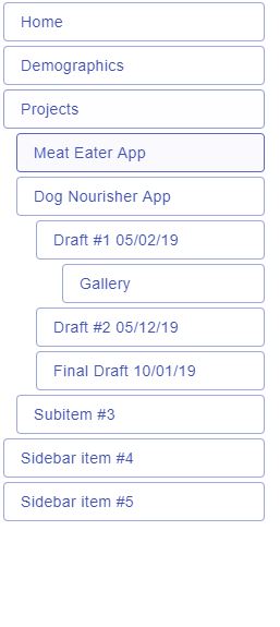
This approach allows you to make dynamic and fluid sidebars because the only dependencies it needs is props.items while the positioning of its inner items are already handled by Sidebar. If any items in the array changes, the sidebar will update accordingly. When only props.items is needed, then it's up to you to decide how the CSS gets implemented.
What this means is that you can re-use this sidebar component for multiple pages, and since the component is dynamic every page can easily show a sidebar with completely different data depending on what you pass in as items.
In practice recursion can be useful elsewhere as explained previously, in many places!
Such as a dropdown menu with nested menu:
import React from 'react'
import Button from '@material-ui/core/Button'
import Menu from '@material-ui/core/Menu'
import MenuItem from '@material-ui/core/MenuItem'
import './styles.css'

const items = [
  { to: '/home', label: 'Home' },
  { to: '/blog', label: 'Blog' },
  { to: '/about', label: 'About' },
  { to: '/contact', label: 'Contact' },
  {
    to: '/help-center',
    label: 'Help Center',
    items: [
      { to: '/privacy-policy', label: 'Privacy Policy' },
      { to: '/tos', label: 'Terms of Service' },
      { to: '/partners', label: 'Partners' },
      {
        to: '/faq',
        label: 'FAQ',
        items: [
          { to: '/faq/newsletter', label: 'Newsletter FAQs' },
          { to: '/faq/career', label: 'Employment/Career FAQs' },
        ],
      },
    ],
  },
]

const MyMenu = React.forwardRef(
  ({ items, anchorEl: anchorElProp, createOnClick, onClose }, ref) => {
    const [anchorEl, setAnchorEl] = React.useState(null)

    return (
      <Menu
        ref={ref}
        open={Boolean(anchorElProp)}
        onClose={onClose}
        anchorEl={anchorElProp}
        anchorOrigin={{ vertical: 'top', horizontal: 'right' }}
        transformOrigin={{ vertical: 'top', horizontal: 'right' }}
      >
        {items.map((item) => (
          <div key={item.to}>
            <MenuItem onMouseEnter={item.items && createOnClick(setAnchorEl)}>
              {item.label}
            </MenuItem>
            {item.items && (
              <MyMenu
                key={item.to}
                items={item.items}
                anchorEl={anchorEl}
                createOnClick={createOnClick}
                onClose={() => setAnchorEl(null)}
              />
            )}
          </div>
        ))}
      </Menu>
    )
  },
)

function App() {
  const [anchorEl, setAnchorEl] = React.useState(null)
  const createOnClick = (callback) => {
    return (e) => {
      e.persist()
      return callback(e.currentTarget)
    }
  }
  return (
    <div>
      <Button onMouseEnter={createOnClick(setAnchorEl)} variant="outlined">
        View More
      </Button>
      <MyMenu
        items={items}
        anchorEl={anchorEl}
        createOnClick={createOnClick}
        onClose={() => setAnchorEl(null)}
      />
    </div>
  )
}
2. Combining Multiple Providers
If you have to have a really large react component (or even an app) that needs to be wrapped in multiple providers, you can do it the regular way:
import { Provider } from 'react-redux'
import { ThemeProvider } from '@material-ui/core/styles/ThemeProvider'
import AppProvider from './components/AppProvider'
import NavbarProvider from './components/NavbarProvider'
import SidebarProvider from './components/SidebarProvider'
import FooterProvider from './components/FooterProvider'
import BlogsProvider from './components/BlogsProvider'
import SentryProvider from './components/SentryProvider'
import BlogsProvider from './components/BlogsProvider'
import store from '../app/store'
import theme from '../app/theme'
import Homepage from './Homepage'

const AllProviders = ({ children }) => (
  <Provider store={store}>
    <ThemeProvider theme={theme}>
      <SentryProvider>
        <AppProvider>
          <NavbarProvider>
            <SidebarProvider>
              <FooterProvider>
                <BlogsProvider>{children}</BlogsProvider>
              </FooterProvider>
            </SidebarProvider>
          </NavbarProvider>
        </AppProvider>
      </SentryProvider>
    </ThemeProvider>
  </Provider>
)

function App() {
  return (
    <AllProviders>
      <Homepage />
    </AllProviders>
  )
}

export default App
This is 100% fine but remember that you can just use regular JavaScript concepts to compose them together:
function combineProviders(...providers) {
  return ({ children }) =>
    providers.reduce(
      (prev, CurrentProvider) => <CurrentProvider>{prev}</CurrentProvider>,
      children,
    )
}
You save lines of code and it looks less bloated:
const CombinedProviders = combineProviders(
  SentryProvider,
  NavbarProvider,
  SidebarProvider,
  FooterProvider,
  BlogsProvider,
)

function App() {
  return (
    <Provider store={store}>
      <ThemeProvider theme={theme}>
        <CombinedProviders>
          <Homepage />
        </CombinedProviders>
      </ThemeProvider>
    </Provider>
  )
}

export default App
3. Declaring Components with an HTML Tag Name as a String
If you haven't known already, you can create a regular react DOM component with simple strings that represent an HTML element tag. More precisely, a string that represents the tag name of an HTML DOM element.
For example, you can create react components by assigning the string 'div' to a variable like so:
import React from 'react'

const MyComponent = 'div'

function App() {
  return (
    <div>
      <h1>Good Morning and Welcome to my Palace!</h1>
      <hr />
      <MyComponent>
        <h3>I am inside a {'<div />'} element</h3>
      </MyComponent>
    </div>
  )
}
React will just call React.createElement and use that string to create the element internally. Isn't that neat?
Used commonly in component libraries like Material-UI, you can declare a component prop which the caller can decide the root node of the component to become the value of props.component like so:
function MyComponent({ component: Component = 'div', name, gender, email }) {
  return (
    <Component>
      <h1>Hi {name}</h1>
      <div>
        <h6>You are a {gender}</h6>
        <small>Your email is {email}</small>
      </div>
    </Component>
  )
}
This is how you can use it:
function App() {
  return (
    <div>
      <MyComponent component="div" name="Ralph" gender="male" email="myemailthatineverread@gmail.com">
    </div>
  )
}
You can also pass in your custom component where that will be used as the root node:
function Dashboard({ children }) {
  return (
    <div style={{ padding: '25px 12px' }}>
      {children}
    </div>
  )
}

function App() {
  return (
    <div>
      <MyComponent component={Dashboard} name="Ralph" gender="male" email="myemailthatineverread@gmail.com">
    </div>
  )
}
The reason why it is useful is because when you want to make a react component reusable and highly customizable, you want to make it barebones as possible. When you default to a div you put it down to its most barebones form for the developer, otherwise you'd have to default it to some other component with that has some implementation details (which the user of your computer probably won't need because they want to implement their own).
4. Mapping Components Through Exports
Sometimes when you have a switch case that takes an input and returns a specific component from it, it can become quite redundant to enter them into the switch cases every time.
It's not uncommon that we see something like this in react today:
import React from 'react'
import { useSelector, useDispatch } from 'react-redux'
import { Modal } from 'components/common'
import LogoutPrompt from './modalComponents/LogoutPrompt'
import CreateFrenchFries from './modalComponents/CreateFrenchFries'
import CreateMashedPotatoes from './modalComponents/CreateMashedPotatoes'
import DeleteFrenchFries from './modalComponents/DeleteFrenchFries'
import DeleteMashedPotatoes from './modalComponents/DeleteMashedPotatoes'
import EditMashedPotatoes from './modalComponents/EditMashedPotatoes'
import UpdatePassword from './modalComponents/UpdatePassword'
import SigninSignup from './modalComponents/SigninSignup'
import * as c from '../constants'

function AppModal() {
  const modal = useSelector(selectModal)
  const dispatchRedux = useDispatch()
  const isLoggedIn = true

  function closeModal() {
    if (isLoggedIn) {
      dispatchRedux(toggle({ opened: false, context: '' }))
    }
  }

  let Component: React.ElementType<any>

  switch (modal.context) {
    case c.LOGOUT_PROMPT:
      Component = LogoutPrompt
      break
    case c.CREATE_FRENCH_FRIES:
      Component = CreateFrenchFries
      break
    case c.CREATE_MASHED_POTATOES:
      Component = CreateMashedPotatoes
      break
    case c.DELETE_FRENCH_FRIES:
      Component = DeleteFrenchFries
      break
    case c.DELETE_MASHED_POTATOES:
      Component = DeleteMashedPotatoes
      break
    case c.EDIT_MASHED_POTATOES:
      Component = EditMashedPotatoes
      break
    case c.UPDATE_PASSWORD:
      Component = UpdatePassword
      break
    default:
      break
  }
}

// @ts-ignore
let Component: React.ElementType<any> = modalComponents[modal.context]

if (!Component) {
  if (!isLoggedIn) {
    Component = SigninSignup
  } else {
    Component = 'div'
  }
}

return (
  <Modal opened={modal.opened || !isLoggedIn} onClose={closeModal}>
    <>
      <Component {...modal} closeModal={closeModal} />
    </>
  </Modal>
)
If you're sure that the props being passed into the component will have the same shape every time, it's probably redundant to write them this way. You can eliminate the redundancy by declaring them as exports from a file instead, which will help to avoid having to use switch cases or if/else conditions:
// <Some file that you will import from>.js
export { default as LOGOUT_PROMPT } from './LogoutPrompt'
export { default as CREATE_FRENCH_FRIES } from './CreateFrenchFries'
export { default as CREATE_MASHED_POTATOES } from './CreateMashedPotatoes'
export { default as DELETE_FRENCH_FRIES } from './DeleteFrenchFries'
export { default as DELETE_MASHED_POTATOES } from './DeleteMashedPotatoes'
export { default as EDIT_MASHED_POTATOES } from './EditMashedPotatoes'
export { default as UPDATE_PASSWORD } from './UpdatePassword'
Once that is set just import them and simply use them easily while keeping the code functioning the same:
import React from 'react'
import { useSelector, useDispatch } from 'react-redux'
import { Modal } from 'components/common'
import SigninSignup from './modalComponents/SigninSignup'
import { toggle } from './appModalSlice'
import { selectModal } from './selectors'
import * as modalComponents from './modalComponents'

function AppModal() {
  const modal = useSelector(selectModal)
  const dispatchRedux = useDispatch()
  const isLoggedIn = true

  function closeModal() {
    if (isLoggedIn) {
      dispatchRedux(toggle({ opened: false, context: '' }))
    }
  }

  let Component: React.ElementType<any> = modalComponents[modal.context]

  if (!Component) {
    if (!isLoggedIn) {
      Component = SigninSignup
    } else {
      Component = 'div'
    }
  }

  return (
    <Modal opened={modal.opened || !isLoggedIn} onClose={closeModal}>
      <>
        <Component {...modal} closeModal={closeModal} />
      </>
    </Modal>
  )
}

export default AppModal
5. Allow Components to be Controlled Elsewhere
When you develop common components such as a horizontal list of tabs, it's pretty useful to have the component highlight a specific item whenever the user clicks on it, just to keep them in check. A common but useful method is to add a distinguished color to a selected item.
While you're developing the implementation details for this component you might have decided to put this functionality into the component. But if you think this component might be useful in the future where it can go hand in hand with another component, it might be a good idea to allow it to switch the control to its parent if the user of your component desires it.
For example, the code below represents a simple navbar where an item is colored purple when the user has selected it:
import React from 'react'
import './styles.css'

function Navbar({
  items,
  selectedItem: selectedItemProp,
  onSelect: onSelectProp = () => {},
}) {
  const { current: isControlled } = React.useRef(selectedItemProp !== undefined)
  const [selectedItem, setSelectedItem] = React.useState(
    isControlled ? selectedItemProp : '/home',
  )

  function onClick(value) {
    return (e) => {
      if (isControlled) {
        onSelectProp(value, e)
      } else {
        setSelectedItem(value)
      }
    }
  }

  const selectedItemResult = isControlled ? selectedItemProp : selectedItem

  return (
    <ul>
      {items.map((item) => (
        <li
          key={item.to}
          onClick={onClick(item.to)}
          style={{
            listStyle: 'none',
            display: 'inline-block',
            marginRight: 15,
            color: selectedItemResult === item.to ? 'purple' : undefined,
          }}
        >
          {item.label}
        </li>
      ))}
    </ul>
  )
}

function App() {
  const [selectedItem, setSelectedItem] = React.useState('/home')

  const items = [
    { to: '/home', label: 'Home' },
    { to: '/blog', label: 'Blog' },
    { to: '/about', label: 'About' },
    { to: '/contact', label: 'Contact' },
  ]
  return (
    <div>
      <Navbar
        items={items}
        selectedItem={selectedItem}
        onSelect={setSelectedItem}
      />
    </div>
  )
}

export default App
This is useful because of two key reasons:
- It now has the ability to be re-used
- It can now be composed with other components to create modules since they can pass the control somewhere else
So in practice, this concept is so powerful that it's being used in many react libraries out there, like downshift.
If we go back to our sidebar snippet and implement nested items with expanding/collapsing functionality and have it support being controlled elsewhere, it becomes much more powerful because now you can let other components expand/collapse any nested items and vice versa. The possibilities are endless!