Build a Character Select Screen in React
July 28th, 2019
Share This Post
React is a JavaScript library well known for its simplicity while still being able to build amazing user interfaces. Huge established websites like Facebook , Netflix, and NY Times have been highly successful maintaining their web apps using React. And thanks to the incredibly active involvement with the open source library it's only getting better every day.
With that said, this article will go through the steps to build a basic character select screen taking advantage of react's mechanics to make it come to life.
The intent of this post is to obviously build a character select screen, but also to show a thought process as we go along and shed some light onto how to solve problems before they come up. Hopefully this approach helps newer react developers!
By the end of this post you should be able to have something like this:
If you want the link to the GitHub repo which includes the additional characters, click here.
I won't be using any UI libraries to make any effects in this post besides installing a loading spinner, because i want everybody to be able to follow along without having to research a library's API to understand the examples.
And without further ado, let's begin!
(Update: I wanted to add more things, but this post was getting ridiculously long!)
In this tutorial we are going to quickly generate a react project with create-react-app
Go ahead and create a project using the command below. For this tutorial i’ll call our project character-select.
npx create-react-app character-selectNow go into the directory once it's done:
cd character-selectInside the main entry src/index.js we're going to clean it up a bit:
import React from 'react'
import ReactDOM from 'react-dom'
import * as serviceWorker from './serviceWorker'
import App from './App'

ReactDOM.render(<App />, document.getElementById('root'))
serviceWorker.unregister()
Here are the starting styles:
src/styles.css
body {
  margin: 0;
  font-family: -apple-system, BlinkMacSystemFont, 'Segoe UI', 'Roboto',
    'Oxygen', 'Ubuntu', 'Cantarell', 'Fira Sans', 'Droid Sans',
    'Helvetica Neue', sans-serif;
  -webkit-font-smoothing: antialiased;
  -moz-osx-font-smoothing: grayscale;
  background: rgb(23, 30, 34);
}

code {
  font-family: source-code-pro, Menlo, Monaco, Consolas, 'Courier New',
    monospace;
}

.root {
  padding: 20px 0;
}
Now go to src/App.js and get started with the root element since we already have the styles defined:
import React from 'react'
import styles from './styles.module.css'

const App = () => <div className={styles.root}>{null}</div>

export default App
Before we proceed, let's explain the flow of this character select screen that we are going to build so that we are all on the same page as we go along.
Lets pretend we are playing an MMORPG game. All players begin by creating a character. Every player start offs with the Novice class by default, and once they make it to level 10 they're able to transform into a tier 2 class (for this post we will just have a Sorceress and a Knight available, but MMORPG games usually have more classes like Archer and Necromancer, etc.). Once they pick a class to morph into when they reach level 10, they will be able to click a button that says "Morph" and their character will change appearance. In between these actions they'll automatically be scrolled down as they go so that we keep it interactive for the player. Then, at the end that will be guided somewhere else to a new screen.
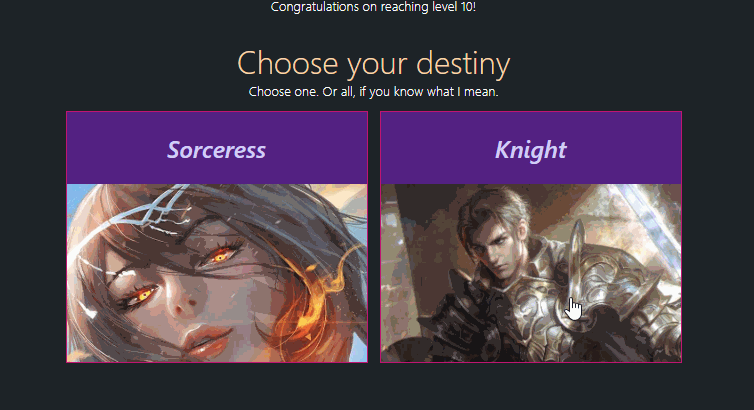
Let's first begin by presenting a screen that congratulates them, followed by showing them two tier 2 classes they can choose to morph their character into.
If they select sorceress, they'll be able to morph into a sorceress and continue on with their journey to become the best player in the game. The same concept goes for the knight option. There's a secret option however. If the player is smart and nosy enough, they will realize that they will be able to select both of them and morph into something extraordinary that mankind has yet to witness. Life is full of surprises, and our game should reflect that in order to stay realistic. Hehe.
To present the screen we are going to present them with a header, a photo of their novice class (because they're never going to be able to see that again), and a heart warming message to remind them that their hard work has paid off.
(The images can be found in the GitHub link above if you want to use the same images while following along)
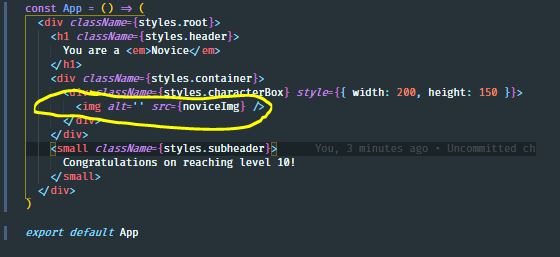
src/App.js
import React from 'react'
import noviceImg from './resources/novice.jpg'
import styles from './styles.module.css'

const App = () => (
  <div className={styles.root}>
    <h1 className={styles.header}>
      You are a <em>Novice</em>
    </h1>
    <div className={styles.content}>
      <div className={styles.characterBox} style={{ width: 200, height: 150 }}>
        <img alt="" src={noviceImg} />
      </div>
    </div>
    <small className={styles.subheader}>
      Congratulations on reaching level 10!
    </small>
  </div>
)

export default App
Here are the new additions to the CSS:
styles.css
.content {
  display: flex;
  justify-content: center;
}

.header {
  text-align: center;
  color: rgb(252, 216, 169);
  font-weight: 300;
  margin: 0;
}

.subheader {
  color: #fff;
  text-align: center;
  font-weight: 300;
  width: 100%;
  display: block;
}

.characterBox {
  transition: all 0.1s ease-out;
  width: 300px;
  height: 250px;
  border: 1px solid rgb(194, 5, 115);
  background: rgb(82, 26, 134);
  margin: 12px 6px;
  overflow: hidden;
}

.characterBox img {
  width: 100%;
  height: 100%;
  object-fit: cover;
  cursor: pointer;
}
Looking at the component, we can see that the root element encompasses a header, a content container, and a subheader as immediate children. Shortly ago I mentioned that we were going to show a photo of a novice to the user, and that's what's happening inside the div element with the className styles.content:
We defined CSS class names for the header and subheader because something tells me these can be re-used for furher interfaces, like when the player is directed to a new section. When I think of the word "section", I think of it containing some header and a body, so this seems like a valid move. We might also be using a "character box" for other characters like mages or whatever, so we defined a .characterBox class name to hold on to that thought while we proceed.
Now that we established the easiest part of this tutorial, lets proceed to the more interesting parts!
The next thing we're going to do is make the the options or selection screen. This screen will be responsible for displaying the character class selections to the player. These characters are called the Sorceress and Knight. This is the screen players will be prompted with as soon as they hit level 10.
The way we can approach this effectively is thinking about what the purpose of the next step is for the player. The purpose is for them to choose between a Sorceress or Knight, so it makes sense to grab some character selection box and just present it to the player.
Now we want to try to avoid creating multiple components that basically do the same thing as much as possible, because it's not a very good practice since you'll be having increasingly difficult times going back and changing code around in the future, or even when debugging small errors.
With that in mind, the next section with the character selection options could have the same structure as the previous (header, content/body, and subheader), as seen in the previous examples.
We'll just re-use this concept to create the character selection screen by abstracting out the header, subheader, and container (or content).
Normally I'd extract these re-usable components into their own file so we can directly import them as individual modules, but to save us some time and space we'll just slap them all into src/components.js
So go ahead and create a components.js file in the same directory and define the re-usables as named exports:
src/components.js
export const Header = ({ children, ...rest }) => (
  // eslint-disable-next-line
  <h1 className={styles.header} {...rest}>
    {children}
  </h1>
)

export const Subheader = ({ children, ...rest }) => (
  <small className={styles.subheader} {...rest}>
    {children}
  </small>
)

export const Content = ({ children, ...rest }) => (
  <div className={styles.content} {...rest}>
    {children}
  </div>
)
Now lets replace the App component with the new re-usables:
src/App.js
import React from 'react'
import noviceImg from './resources/novice.jpg'
import styles from './styles.module.css'
import { Header, Subheader, Content } from './components'

const App = () => (
  <div className={styles.root}>
    <Header>
      You are a <em>Novice</em>
    </Header>
    <Content>
      <div className={styles.characterBox} style={{ width: 200, height: 150 }}>
        <img alt="" src={noviceImg} />
      </div>
    </Content>
    <Subheader>Congratulations on reaching level 10!</Subheader>
  </div>
)

export default App
The code is starting to look a little nicer now, isn't it? Now we'll go ahead and make the screen showing the character classes:
src/App.js
import React from 'react'
import noviceImg from './resources/novice.jpg'
import sorceressImg from './resources/sorceress.jpg'
import knightImg from './resources/knight.jpg'
import styles from './styles.module.css'
import { Header, Subheader, Content } from './components'
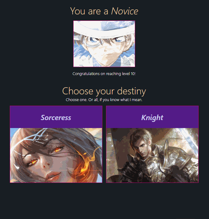
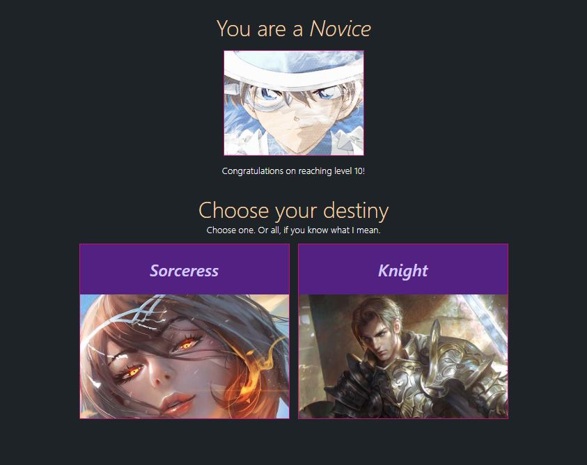
const App = () => (
<div className={styles.root}>
<Header>
You are a <em>Novice</em>
</Header>
<Content>
<div className={styles.characterBox} style={{ width: 200, height: 150 }}>
<img alt="" src={noviceImg} />
</div>
</Content>
<Subheader>Congratulations on reaching level 10!</Subheader>
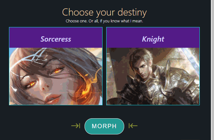
<div style={{ margin: '25px auto' }}>
<Header>Choose your destiny</Header>
<Subheader>Choose one. Or all, if you know what I mean.</Subheader>
<Content>
<div className={styles.characterBox}>
<h2>Sorceress</h2>
<img alt="" src={sorceressImg} />
</div>
<div className={styles.characterBox}>
<h2>Knight</h2>
<img alt="" src={knightImg} />
</div>
</Content>
</div>
</div>
)
export default AppAnd here is the new addition to styles.module.css:
.characterBox h2 {
  transition: all 0.3s ease-out;
  text-align: center;
  color: rgb(213, 202, 255);
  font-style: italic;
  font-weight: 500;
}
With this change, our interface now looks like this:
You can see that in the code we were able to re-use the Header, Subheader and Content for the next section. The interface looks consistent, and we gained a very important benefit: We now only need to change the header/subheader/content components in one place instead of multiple places in the future! Some other notable benefits gained from this approach is implicit documentation (we now just know that those are the header and subheader components and can easily go back and understand the code in a snap).
The next thing we're going to do is make the Sorceress and Knight box invoke some type of action as soon as they are clicked.
We'll just define a useless onSelect handler just so we define some "structure" so we can constantly be reminded that there is some click action for later use:
const App = () => {
  const onSelect = (e) => {
    console.log("Don't mind me. I'm useless until I become useful")
  }

  return (
    <div className={styles.root}>
      <Header>
        You are a <em>Novice</em>
      </Header>
      <Content>
        <div
          className={styles.characterBox}
          style={{ width: 200, height: 150 }}
        >
          <img alt="" src={noviceImg} />
        </div>
      </Content>
      <Subheader>Congratulations on reaching level 10!</Subheader>
      <div style={{ margin: '25px auto' }}>
        <Header>Choose your destiny</Header>
        <Subheader>Choose one. Or all, if you know what I mean.</Subheader>
        <Content>
          <div onClick={onSelect} className={styles.characterBox}>
            <h2>Sorceress</h2>
            <img alt="" src={sorceressImg} />
          </div>
          <div onClick={onSelect} className={styles.characterBox}>
            <h2>Knight</h2>
            <img alt="" src={knightImg} />
          </div>
        </Content>
      </div>
    </div>
  )
}
Things are looking great, however there isn't a way to tell which character the player selected without any visual changes (since all we're doing is logging "I'm useless" to the console):

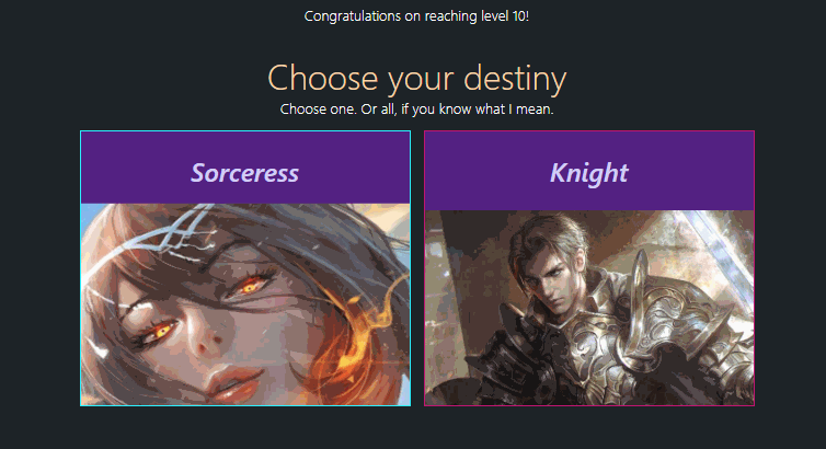
We can first make it a little more interactive by proving a hover effect, which is still a step ahead since it's better than a still image.
Now since we're going to begin merging class names so that we can have several affects happening in parallel for individual elements, I'm going to install the handy classnames library to do the merging for us:
npm install --save classnamesclassnames's strength shines when you need to apply class names according to specific conditions. We're going to need that since certain elements need to be visible or hidden only at certain times.
Let's now add some styles for the character box elements:
.characterBox:hover h2 {
  color: rgb(191, 255, 241);
}

.characterBox img {
  transition: all 0.3s ease-out;
  width: 100%;
  height: 100%;
  object-fit: cover;
  cursor: pointer;
}

.characterBox img.tier2:hover {
  animation: hueRotate 2s infinite;
  transform: scale(1.05);
}

@keyframes hueRotate {
  0% {
    filter: hue-rotate(0deg);
  }
  50% {
    filter: hue-rotate(260deg) grayscale(100%);
  }
  100% {
    filter: hue-rotate(0deg);
  }
}
We're applying an infinitely changing hue-rotate filter when a player hovers over to make these stand out. The player should be excited to morph into a tier2 class! :)
Right now, these hover effects won't do anything because we need to apply the new class names as shown in the CSS. All we need to do is apply the className attribute to the tier2 image elements:
src/App.js
<div style={{ margin: '25px auto' }}>
  <Header>Choose your destiny</Header>
  <Subheader>Choose one. Or all, if you know what I mean.</Subheader>
  <Content>
    <div onClick={onClick} className={styles.characterBox}>
      <h2>Sorceress</h2>
      <img alt="" src={sorceressImg} className={styles.tier2} />
    </div>
    <div onClick={onClick} className={styles.characterBox}>
      <h2>Knight</h2>
      <img alt="" src={knightImg} className={styles.tier2} />
    </div>
  </Content>
</div>
And voila! We now have some color changing hover effect:
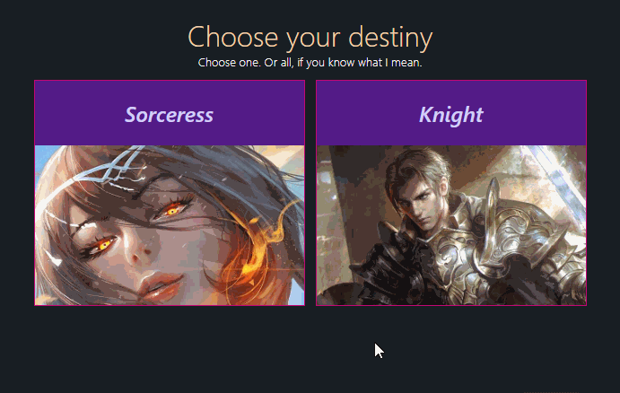
So we have the hover effect but we now need a style for cases when one of them is selected. That means we have to make some styles stay when the player selects a character.
With that said, we can now introduce react hooks into the play. So lets go ahead and create a custom hook called useLevelUpScreen right above the App component and define the select state along with an onSelect handler to update it:
src/App.js
import React from 'react'
import cx from 'classnames'
import noviceImg from './resources/novice.jpg'
import sorceressImg from './resources/sorceress.jpg'
import knightImg from './resources/knight.jpg'
import styles from './styles.module.css'
import { Header, Subheader, Content } from './components'

const useLevelUpScreen = () => {
  const [selected, setSelected] = React.useState([])

  const onSelect = (type) => (e) => {
    setSelected((prevSelected) => {
      if (prevSelected.includes(type)) {
        return prevSelected.filter((t) => t !== type)
      }
      return [...prevSelected, type]
    })
  }

  return {
    selected,
    onSelect,
  }
}

const App = () => {
  const { selected, onSelect } = useLevelUpScreen()

  return (
    <div className={styles.root}>
      <Header>
        You are a <em>Novice</em>
      </Header>
      <Content>
        <div
          className={styles.characterBox}
          style={{ width: 200, height: 150 }}
        >
          <img alt="" src={noviceImg} />
        </div>
      </Content>
      <Subheader>Congratulations on reaching level 10!</Subheader>
      <div style={{ margin: '25px auto' }}>
        <Header>Choose your destiny</Header>
        <Subheader>Choose one. Or all, if you know what I mean.</Subheader>
        <Content>
          <div onClick={onSelect('Sorceress')} className={styles.characterBox}>
            <h2>Sorceress</h2>
            <img alt="" src={sorceressImg} className={styles.tier2} />
          </div>
          <div onClick={onSelect('Knight')} className={styles.characterBox}>
            <h2>Knight</h2>
            <img alt="" src={knightImg} className={styles.tier2} />
          </div>
        </Content>
      </div>
    </div>
  )
}

export default App
Inside useLevelUpScreen we defined the selected state which will help us determine which tier2 class the player selected. The onSelect handler is the API to update that state. It uses the callback version of useState in order to ensure that it accurately receives the latest update to the selected state. Inside the callback it checks to see if type (which is either Knight or Sorceress in our case) is already selected. If it is then we'll assume the player decided to deselect the selection so we filter it out for the next state update, and vice versa.
We then applied the onSelect handler to the elements that need them in the App component:
src/App.js
const App = () => {
  const { selected, onSelect } = useLevelUpScreen()

  return (
    <div className={styles.root}>
      <Header>
        You are a <em>Novice</em>
      </Header>
      <Content>
        <div
          className={styles.characterBox}
          style={{ width: 200, height: 150 }}
        >
          <img alt="" src={noviceImg} />
        </div>
      </Content>
      <Subheader>Congratulations on reaching level 10!</Subheader>
      <div style={{ margin: '25px auto' }}>
        <Header>Choose your destiny</Header>
        <Subheader>Choose one. Or all, if you know what I mean.</Subheader>
        <Content>
          <div onClick={onSelect('Sorceress')} className={styles.characterBox}>
            <h2>Sorceress</h2>
            <img alt="" src={sorceressImg} className={styles.tier2} />
          </div>
          <div onClick={onSelect('Knight')} className={styles.characterBox}>
            <h2>Knight</h2>
            <img alt="" src={knightImg} className={styles.tier2} />
          </div>
        </Content>
      </div>
    </div>
  )
}
We should now be receiving updates on which character is selected and what isn't. This won't reflect on the user interface to the player yet because we didn't apply it in the component yet, so we'll do that next. For this next step we're going to use the classnames package to conditionally apply the class name to the elements, like this:
src/App.js
const App = () => {
  const { selected, onSelect } = useLevelUpScreen()

  return (
    <div className={styles.root}>
      <Header>
        You are a <em>Novice</em>
      </Header>
      <Content>
        <div
          className={styles.characterBox}
          style={{ width: 200, height: 150 }}
        >
          <img alt="" src={noviceImg} />
        </div>
      </Content>
      <Subheader>Congratulations on reaching level 10!</Subheader>
      <div style={{ margin: '25px auto' }}>
        <Header>Choose your destiny</Header>
        <Subheader>Choose one. Or all, if you know what I mean.</Subheader>
        <Content>
          <div
            onClick={onSelect('Sorceress')}
            className={cx(styles.characterBox, {
              [styles.selectedBox]: selected.includes('Sorceress'),
            })}
          >
            <h2>Sorceress</h2>
            <img
              alt=""
              src={sorceressImg}
              className={cx(styles.tier2, {
                [styles.selected]: selected.includes('Sorceress'),
              })}
            />
          </div>
          <div
            onClick={onSelect('Knight')}
            className={cx(styles.characterBox, {
              [styles.selectedBox]: selected.includes('Knight'),
            })}
          >
            <h2>Knight</h2>
            <img
              alt=""
              src={knightImg}
              className={cx(styles.tier2, {
                [styles.selected]: selected.includes('Knight'),
              })}
            />
          </div>
        </Content>
      </div>
    </div>
  )
}
With the addition of these new styles, we must update the styles to accomodate it:
src/styles.css
.selectedBox {
  border: 1px solid rgb(24, 240, 255) !important;
}

.characterBox img.tier2:hover,
.characterBox img.selected {
  animation: hueRotate 2s infinite;
  transform: scale(1.05);
}
^ (Note the sneaky ".characterBox img.selected" was appended as siblings after the hover line)
With this change, we should now have two beautiful reactive character selection boxes!
Earlier in the tutorial we did mention that if the player was nosy and smart enough they would find out that if they select both the Sorceress and Knight and attempt to morph (the original intent to the player is to select one character, but little do they know we provided a cool secret character), they would be able to do so and morph into something unexpected. We're obviously going to need to give the player some kind of UI element(s) so that they can morph their novice on their behalf. In that case we need a button.
We'll write a simple button and attach an onMorph handler that we're going to create as well as applying styles.morph to the button's className:
src/App.js
const App = () => {
  const { selected, onSelect, morphed, onMorph } = useLevelUpScreen()

  return (
    <div className={styles.root}>
      <Header>
        You are a <em>Novice</em>
      </Header>
      <Content>
        <div
          className={styles.characterBox}
          style={{ width: 200, height: 150 }}
        >
          <img alt="" src={noviceImg} />
        </div>
      </Content>
      <Subheader>Congratulations on reaching level 10!</Subheader>
      <div style={{ margin: '25px auto' }}>
        <Header>Choose your destiny</Header>
        <Subheader>Choose one. Or all, if you know what I mean.</Subheader>
        <Content>
          <div
            onClick={onSelect('Sorceress')}
            className={cx(styles.characterBox, {
              [styles.selectedBox]: selected.includes('Sorceress'),
            })}
          >
            <h2>Sorceress</h2>
            <img
              alt=""
              src={sorceressImg}
              className={cx(styles.tier2, {
                [styles.selected]: selected.includes('Sorceress'),
              })}
            />
          </div>
          <div
            onClick={onSelect('Knight')}
            className={cx(styles.characterBox, {
              [styles.selectedBox]: selected.includes('Knight'),
            })}
          >
            <h2>Knight</h2>
            <img
              alt=""
              src={knightImg}
              className={cx(styles.tier2, {
                [styles.selected]: selected.includes('Knight'),
              })}
            />
          </div>
        </Content>
      </div>
      <div className={styles.morph}>
        <button
          name="morph"
          type="button"
          className={styles.morph}
          onClick={onMorph}
        >
          Morph
        </button>
      </div>
    </div>
  )
}
If you look at what came back out from the useLevelUpScreen hook we can see that there are two new additions: morphed and onMorph. And they're going to be defined inside the custom hook:
src/useLevelUpScreen.js
const useLevelUpScreen = () => {
  const [selected, setSelected] = React.useState([])
  const [morphed, setMorphed] = React.useState(false)

  const onSelect = (type) => (e) => {
    setSelected((prevSelected) => {
      if (prevSelected.includes(type)) {
        return prevSelected.filter((t) => t !== type)
      }
      return [...prevSelected, type]
    })
  }

  const onMorph = () => {
    setTimeout(() => {
      setMorphed(true)
    }, 1500) // simulating a real server / api call response time
  }

  return {
    selected,
    onSelect,
    morphed,
    onMorph,
  }
}
And here's the style for the styles.morph className:
src/styles.module.css
.morph {
  margin: 50px auto;
  text-align: center;
}
Here is what we have so far:
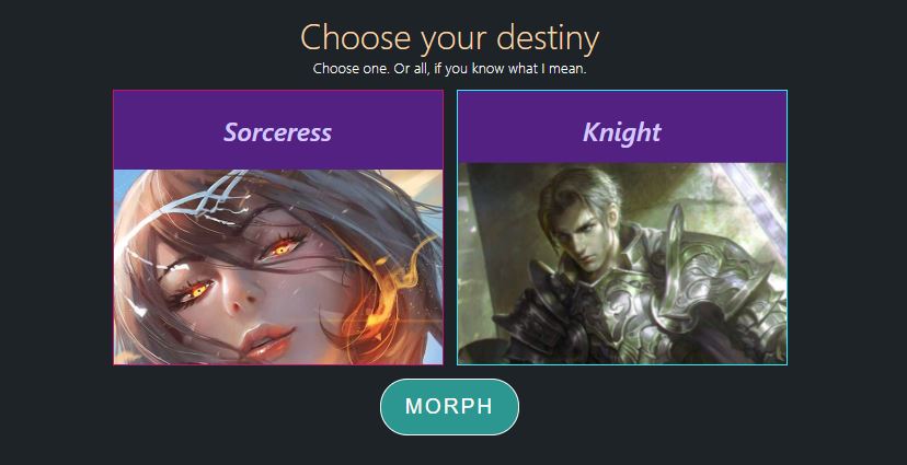
Personally I prefer to hide the morph button until a selection has been made to keep the player only focused on selecting a character class. So i'd apply some kind of hidden visibility effect until selected is populated with something:
{
  !!selected.length && (
    <div>
      <button
        name="morph"
        type="button"
        className={styles.morph}
        onClick={onMorph}
      >
        Morph
      </button>
    </div>
  )
}
Note: We wrapped the button with a div element so that we can have a finer control over the positioning and spacing of the button.
Now the user clearly knows he or she needs to select something since that will be the only option we make available to them:
The button seems a little plain. We're trying to keep the player motivated and happy that they've gone this far to level 10. So for this next step, I placed icons to the left and right of the morph button which you can also use to follow along by installing react-icons.
npm install --save react-icons(Note: If you are getting an error with installing the package using NPM, try installing yarn and adding the package again by running yarn add react-icons. You can go back to NPM to start the server afterwards)
Then, I imported this icon component:
import { MdKeyboardTab } from 'react-icons/md'And inserted one right before the button, and one afterwards. Now the arrow icons are being still and they're both facing the same direction. We have to add some life to them by styling them and giving them an infinitely looping color-changing effect, in addition to fixing the direction on the right arrow icon to point towards the button:
Styles used:
src.styles.module.css
.morphArrow {
  color: rgb(123, 247, 199);
  transform: scale(2);
  animation: morphArrow 2s infinite;
}

.morphArrowFlipped {
  composes: morphArrow;
  transform: scale(-2, 2);
}

@keyframes morphArrow {
  0% {
    opacity: 1;
    color: rgb(123, 247, 199);
  }
  40% {
    opacity: 0.4;
    color: rgb(248, 244, 20);
  }
  100% {
    opacity: 1;
    color: rgb(123, 247, 199);
  }
}
Now, compared to previously, we can be assured that the player will be more excited to start the next chapter of their adventure!
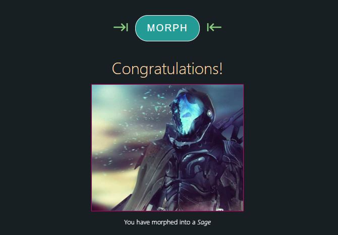
Our current onMorph function sets the morphed state to true upon clicking, so we can now display the secret character class that the player chose to morph into as soon as morphed transitions to true. We're going to place this right under the div element containing the morph button:
src/App.js
// at the top:
import sageImg from './resources/sage.jpg'

// ...

{
  morphed && (
    <div className={styles.morphed}>
      <Header>Congratulations!</Header>
      <Content>
        <div className={styles.characterBox}>
          <img src={sageImg} />
        </div>
      </div>
      <Subheader>
        You have morphed into a <em>Sage</em>
      </Subheader>
    </div>
  )
}
src/styles.module.css
.morphed {
  animation: flashfade 4s forwards;
  opacity: 0;
}

@keyframes flashfade {
  0% {
    opacity: 0;
  }
  60% {
    opacity: 0.7;
  }
  100% {
    opacity: 1;
  }
}
The secret class they'll be morphing into is a Sage! Here's how it looks like now:
I could be okay with how this plays out. But everything still looks a little "stiff" to me. In other words, I think the player needs some scroll-to action so that they are constantly busy with our interface. We're going to install a small library called react-scroll-to-component that will allow us to scroll the player's screen into any element by passing in the element's reference:
npm install --save react-scroll-to-componentImport it inside src/App.js:
import scrollToComponent from 'react-scroll-to-component'Now let's go ahead and create a ref in addition to attaching the ref to the element:
const App = () => {
  const morphedRef = React.createRef()
  const { selected, onSelect, morphed, onMorph } = useLevelUpScreen({ morphedRef })

// ...

   {morphed && (
    <div
      className={cx({
        [styles.morphed]: morphed,
        [styles.hidden]: !morphed,
      })}
    >
      <Header>Congratulations!</Header>
      <Content>
        <div ref={morphedRef} className={styles.characterBox}>
          <img src={sageImg} />
        </div>
      </Content>
      <Subheader>
        You have morphed into a <em>Sage</em>
      </Subheader>
    </div>
  )}
Since we want this scrolling effect to look smooth we need to add more height to the bottom of the page so we have more room. We can actually do that easily by adding an empty div with a height when morphed switches to true:
{
  morphed && (
    <div
      className={cx({
        [styles.morphed]: morphed,
        [styles.hidden]: !morphed,
      })}
    >
      <Header>Congratulations!</Header>
      <Content>
        <div ref={morphedRef} className={styles.characterBox}>
          <img src={sageImg} />
        </div>
      </Content>
      <Subheader>
        You have morphed into a <em>Sage</em>
      </Subheader>
    </div>
  )
}
{
  morphed && <div style={{ height: '30vh' }} />
}
But there's now a problem. The height won't be able to make it on the screen on time before the sage area becomes visible. In other words, the scroll-to functionality isn't working because at the time of invoking it doesn't see further space yet. We're going to get around this by adding an extra state called morphing which will give us some time to wreck havoc in the UI until morphed becomes true:
const useLevelUpScreen = ({ morphedRef }) => {
  const [selected, setSelected] = React.useState([])
  const [morphing, setMorphing] = React.useState(false)
  const [morphed, setMorphed] = React.useState(false)

  const onSelect = (type) => (e) => {
    setSelected((prevSelected) => {
      if (prevSelected.includes(type)) {
        return prevSelected.filter((t) => t !== type)
      }
      return [...prevSelected, type]
    })
  }

  const onMorph = () => {
    setMorphing(true)
    setTimeout(() => {
      setMorphed(true)
      setMorphing(false)
    }, 1500)
  }

  React.useEffect(() => {
    if (morphed) {
      scrollToComponent(morphedRef.current, {
        offset: 100,
        align: 'middle',
        duration: 1000,
      })
    }
  }, [morphed, morphedRef])

  return {
    selected,
    onSelect,
    morphed,
    onMorph,
    morphing,
  }
}
We're now confronted with a new issue however. It seems like morphed is blocking the elements inside from rendering thus blocking us from applying logic within the 1.5 second time frame:
const App = () => {
  const morphedRef = React.createRef()
  const { selected, onSelect, morphing, morphed, onMorph } = useLevelUpScreen()

// ...

{morphed && (
  <div
    className={cx({
      [styles.morphed]: morphed,
      [styles.hidden]: !morphed,
    })}
  >
    <Header>Congratulations!</Header>
    <Content>
      <div ref={morphedRef} className={styles.characterBox}>
        <img src={sageImg} />
      </div>
    </Content>
    <Subheader>
      You have morphed into a <em>Sage</em>
    </Subheader>
  </div>
)}
{morphed && <div style={{ height: '30vh' }} />}
What we're going to do is take out the morphed && conditional and instead use the classnames package to merge some additional styles. These styles will mimic the behavior and will keep the elements in the react tree so that they can support features like animation:
;<div
  className={cx({
    [styles.morphed]: morphed,
    [styles.hidden]: !morphed,
  })}
>
  <Header>Congratulations!</Header>
  <Content>
    <div ref={morphedRef} className={styles.characterBox}>
      <img src={sageImg} />
    </div>
  </Content>
  <Subheader>
    You have morphed into a <em>Sage</em>
  </Subheader>
</div>
{
  morphing || (morphed && <div style={{ height: '30vh' }} />)
}Edit: I forgot to include the part where we also apply another ref to the morph button to make the page scroll there when a player selects a character class. Sorry about that!
src/App.js:
const useLevelUpScreen = ({ morphRef, morphedRef }) => {
// ...

const onSelect = (type) => (e) => {
  setSelected((prevSelected) => {
    if (prevSelected.includes(type)) {
      return prevSelected.filter((t) => t !== type)
    }
    return [...prevSelected, type]
  })
  scrollToComponent(morphRef.current, {
    offset: 300,
    align: 'bottom',
    duration: 1000,
  })
}

const onMorph = () => {
  if (!morphing) setMorphing(true)
  setTimeout(() => {
    setMorphing(false)
    setMorphed(true)
  }, 1500)
}

// ...

return {
  selected,
  onSelect,
  morphed,
  morphing,
  onMorph,
}

const App = () => {
  const morphRef = React.createRef()
  const morphedRef = React.createRef()

  // ...

 <div
   ref={morphRef}
    className={cx(styles.morph, {
      [styles.hidden]: !selected.length,
    })}
  >
  <MdKeyboardTab className={styles.morphArrow} />
  <button
    ref={morphRef}
    name='morph'
    type='button'
    className={styles.morph}
    style={{ opacity: morphed ? '0.4' : 1 }}
    onClick={onMorph}
    disabled={morphed}
  >
    {morphing ? 'Morphing...' : morphed ? 'Morphed' : 'Morph'}
  </button>
  <MdKeyboardTab className={styles.morphArrowFlipped} />
</div>
In the example above we applied a style={{ opacity: morphed ? '0.4' : 1 }} once the morph is done to signal to the player that the button will no longer be available. We applied a disable attribute to disable click events with disabled={morphed}. We also changed the text according to the morph state updates with {morphing ? 'Morphing...' : morphed ? 'Morphed' : 'Morph'} to keep the user constantly busy with looking at things that are changing. Oh yeah we also removed the {!!selected.length && ( that was wrapping the morph button because it was blocking our animation just as we talked about recently with the other part of the code, and applied the morphRef ref to it as shown above. Oh yeah and in the custom hook we also applied the scrollToComponent implementation at the end of the onSelect function to animate the scroll to the morph button.
*Ended edit
Once the morphing is complete we're going to simulate some kind of loading animation to let the user know that we are processing the next steps:
<div
  className={cx(styles.next, {
    [styles.hidden]: !ready,
  })}
>
  <div>
    <RingLoader size={60} color="rgb(213, 202, 255)" loading />
    <p>Loading...</p>
  </div>
</div>
The styles:
.next {
  text-align: center;
  margin: 35px auto;
  display: flex;
  justify-content: center;
}

.next p {
  font-family: Patua One, sans-serif;
  font-weight: 300;
  text-align: center;
  color: #fff;
}
You can see that there is also a new state called ready so we have to implement that in the custom hook:
const useLevelUpScreen = ({ morphRef, morphedRef }) => {
  const [selected, setSelected] = React.useState([])
  const [morphing, setMorphing] = React.useState(false)
  const [morphed, setMorphed] = React.useState(false)
  const [ready, setReady] = React.useState(false)

  const onSelect = (type) => (e) => {
    setSelected((prevSelected) => {
      if (prevSelected.includes(type)) {
        return prevSelected.filter((t) => t !== type)
      }
      return [...prevSelected, type]
    })
    scrollToComponent(morphRef.current, {
      offset: 300,
      align: 'bottom',
      duration: 1000,
    })
  }

  const onMorph = () => {
    setMorphing(true)
    setTimeout(() => {
      setMorphing(false)
      setMorphed(true)
    }, 1500)
  }

  React.useEffect(() => {
    if (morphed && !ready) {
      scrollToComponent(morphedRef.current, {
        offset: 100,
        align: 'middle',
        duration: 1000,
      })
      setTimeout(() => {
        setReady(true)
      }, 2000)
    }
  }, [morphed, morphedRef, ready])

  return {
    selected,
    onSelect,
    morphed,
    morphing,
    onMorph,
    ready,
  }
}
Finally, we're going to fade the whole page down afterwards so we can begin the next pages as the current one is finished. That means we're going to add another state to the custom hook called shutdown and apply a new class name to the root div element. The shutdown state will switch to true only when ready becomes true.
const useLevelUpScreen = ({ morphRef, morphedRef }) => {
  const [selected, setSelected] = React.useState([])
  const [morphing, setMorphing] = React.useState(false)
  const [morphed, setMorphed] = React.useState(false)
  const [ready, setReady] = React.useState(false)
  const [shutdown, setShutdown] = React.useState(false)

  const onSelect = (type) => (e) => {
    setSelected((prevSelected) => {
      if (prevSelected.includes(type)) {
        return prevSelected.filter((t) => t !== type)
      }
      return [...prevSelected, type]
    })
    scrollToComponent(morphRef.current, {
      offset: 300,
      align: 'bottom',
      duration: 1000,
    })
  }

  const onMorph = () => {
    setMorphing(true)
    setTimeout(() => {
      setMorphing(false)
      setMorphed(true)
    }, 1500)
  }

  React.useEffect(() => {
    if (morphed && !ready) {
      scrollToComponent(morphedRef.current, {
        offset: 100,
        align: 'middle',
        duration: 1000,
      })
    setTimeout(() => {
      setReady(true)
    }, 2000)
    }
  }, [morphed, morphedRef, ready])

  React.useEffect(() => {
    if (ready && !shutdown) {
      setTimeout(() => {
        setShutdown(true)
      }, 2000)
    }
  }, [ready, shutdown])

  return {
    selected,
    onSelect,
    morphed,
    morphing,
    onMorph,
    ready,
    shutdown,
  }
}

const App = () => {
  const morphRef = React.createRef()
  const morphedRef = React.createRef()
  const {
    selected,
    onSelect,
    morphing,
    morphed,
    onMorph,
    ready,
    shutdown,
  } = useLevelUpScreen({
    morphRef,
    morphedRef,
  })

  const onClick = (e) => {
    console.log("Don't mind me. I'm useless until I become useful")
  }

  return (
    <div
      className={cx(styles.root, {
        [styles.shutdown]: shutdown,
      })}
And here is the final result!
Here's what the entire code looks like:
src/App.js
import React from 'react'
import cx from 'classnames'
import { RingLoader } from 'react-spinners'
import { MdKeyboardTab } from 'react-icons/md'
import scrollToComponent from 'react-scroll-to-component'
import noviceImg from './resources/novice.jpg'
import sorceressImg from './resources/sorceress.jpg'
import knightImg from './resources/knight.jpg'
import sageImg from './resources/sage.jpg'
import styles from './styles.module.css'
import { Header, Subheader, Content } from './components'

const useLevelUpScreen = ({ morphRef, morphedRef }) => {
  const [selected, setSelected] = React.useState([])
  const [morphing, setMorphing] = React.useState(false)
  const [morphed, setMorphed] = React.useState(false)
  const [ready, setReady] = React.useState(false)
  const [shutdown, setShutdown] = React.useState(false)

  const onSelect = (type) => (e) => {
    setSelected((prevSelected) => {
      if (prevSelected.includes(type)) {
        return prevSelected.filter((t) => t !== type)
      }
      return [...prevSelected, type]
    })
    scrollToComponent(morphRef.current, {
      offset: 300,
      align: 'bottom',
      duration: 1000,
    })
  }

  const onMorph = () => {
    setMorphing(true)
    setTimeout(() => {
      setMorphing(false)
      setMorphed(true)
    }, 1500)
  }

  React.useEffect(() => {
    if (morphed && !ready) {
      scrollToComponent(morphedRef.current, {
        offset: 100,
        align: 'middle',
        duration: 1000,
      })
      setTimeout(() => {
        setReady(true)
      }, 2000)
    }
  }, [morphed, morphedRef, ready])

  React.useEffect(() => {
    if (ready && !shutdown) {
      setTimeout(() => {
        setShutdown(true)
      }, 2000)
    }
  }, [ready, shutdown])

  return {
    selected,
    onSelect,
    morphed,
    morphing,
    onMorph,
    ready,
    shutdown,
  }
}

const App = () => {
  const morphRef = React.createRef()
  const morphedRef = React.createRef()
  const {
    selected,
    onSelect,
    morphing,
    morphed,
    onMorph,
    ready,
    shutdown,
  } = useLevelUpScreen({
    morphRef,
    morphedRef,
  })

  return (
    <div
      className={cx(styles.root, {
        [styles.shutdown]: shutdown,
      })}
    >
      <Header>
        You are a <em>Novice</em>
      </Header>
      <Content>
        <div
          className={styles.characterBox}
          style={{ width: 200, height: 150 }}
        >
          <img alt="" src={noviceImg} />
        </div>
      </Content>
      <Subheader>Congratulations on reaching level 10!</Subheader>
      <div style={{ margin: '25px auto' }}>
        <Header>Choose your destiny</Header>
        <Subheader>Choose one. Or all, if you know what I mean.</Subheader>
        <Content>
          <div
            onClick={onSelect('Sorceress')}
            className={cx(styles.characterBox, {
              [styles.selectedBox]: selected.includes('Sorceress'),
            })}
          >
            <h2>Sorceress</h2>
            <img
              alt=""
              src={sorceressImg}
              className={cx(styles.tier2, {
                [styles.selected]: selected.includes('Sorceress'),
              })}
            />
          </div>
          <div
            onClick={onSelect('Knight')}
            className={cx(styles.characterBox, {
              [styles.selectedBox]: selected.includes('Knight'),
            })}
          >
            <h2>Knight</h2>
            <img
              alt=""
              src={knightImg}
              className={cx(styles.tier2, {
                [styles.selected]: selected.includes('Knight'),
              })}
            />
          </div>
        </Content>
      </div>
      <div
        ref={morphRef}
        className={cx(styles.morph, {
          [styles.hidden]: !selected.length,
        })}
      >
        <MdKeyboardTab className={styles.morphArrow} />
        <button
          ref={morphRef}
          name="morph"
          type="button"
          className={styles.morph}
          style={{ opacity: morphed ? '0.4' : 1 }}
          onClick={onMorph}
          disabled={morphed}
        >
          {morphing ? 'Morphing...' : morphed ? 'Morphed' : 'Morph'}
        </button>
        <MdKeyboardTab className={styles.morphArrowFlipped} />
      </div>
      <div
        className={cx({
          [styles.morphed]: morphed,
          [styles.hidden]: !morphed,
        })}
      >
        <Header>Congratulations!</Header>
        <Content>
          <div ref={morphedRef} className={styles.characterBox}>
            <img src={sageImg} />
          </div>
        </Content>
        <Subheader>
          You have morphed into a <em>Sage</em>
        </Subheader>
      </div>
      <div
        className={cx(styles.next, {
          [styles.hidden]: !ready,
        })}
      >
        <div>
          <RingLoader size={60} color="rgb(213, 202, 255)" loading />
          <p>Loading...</p>
        </div>
      </div>
    </div>
  )
}

export default App
src/components.js
import React from 'react'
import cx from 'classnames'
import styles from './styles.module.css'

export const Header = ({ children, ...rest }) => (
  // eslint-disable-next-line
  <h1 className={styles.header} {...rest}>
    {children}
  </h1>
)

export const Subheader = ({ children, ...rest }) => (
  <small className={styles.subheader} {...rest}>
    {children}
  </small>
)

export const Content = ({ children, ...rest }) => (
  <div className={styles.container} {...rest}>
    {children}
  </div>
)
src/styles.module.css
body {
margin: 0;
font-family: -apple-system, BlinkMacSystemFont, 'Segoe UI', 'Roboto',
'Oxygen', 'Ubuntu', 'Cantarell', 'Fira Sans', 'Droid Sans',
'Helvetica Neue', sans-serif;
-webkit-font-smoothing: antialiased;
-moz-osx-font-smoothing: grayscale;
background: rgb(23, 30, 34);
}
code {
font-family: source-code-pro, Menlo, Monaco, Consolas, 'Courier New',
monospace;
}
.root {
padding: 20px 0;
}
.container {
display: flex;
justify-content: center;
}
.header {
text-align: center;
color: rgb(252, 216, 169);
font-weight: 300;
margin: 0;
}
.subheader {
color: #fff;
text-align: center;
font-weight: 300;
width: 100%;
display: block;
}
.characterBox {
transition: all 0.1s ease-out;
width: 300px;
height: 250px;
border: 1px solid rgb(194, 5, 115);
background: rgb(82, 26, 134);
margin: 12px 6px;
overflow: hidden;
}
.characterBox img {
width: 100%;
height: 100%;
object-fit: cover;
cursor: pointer;
}
.selectedBox {
border: 1px solid rgb(24, 240, 255) !important;
}
.characterBox h2 {
transition: all 0.3s ease-out;
text-align: center;
color: rgb(213, 202, 255);
font-style: italic;
font-weight: 500;
}
.characterBox:hover h2 {
color: rgb(191, 255, 241);
}
.characterBox img {
transition: all 0.3s ease-out;
width: 100%;
height: 100%;
object-fit: cover;
cursor: pointer;
}
.characterBox img.tier2:hover,
.characterBox img.selected {
animation: hueRotate 2s infinite;
transform: scale(1.05);
}
.morph {
margin: 30px auto;
text-align: center;
}
.morphArrow {
color: rgb(123, 247, 199);
transform: scale(2);
animation: morphArrow 2s infinite;
}
.morphArrowFlipped {
composes: morphArrow;
transform: scale(-2, 2);
}
@keyframes morphArrow {
0% {
opacity: 1;
color: rgb(123, 247, 199);
}
40% {
opacity: 0.4;
color: rgb(248, 244, 20);
}
100% {
opacity: 1;
color: rgb(123, 247, 199);
}
}
button.morph {
cursor: pointer;
transition: all 0.2s ease-out;
border-radius: 25px;
padding: 14px 22px;
color: #fff;
background: rgb(35, 153, 147);
border: 1px solid #fff;
font-family: Patua One, sans-serif;
font-size: 1.2rem;
text-transform: uppercase;
letter-spacing: 2px;
margin: 0 20px;
}
button.morph:hover {
background: none;
border: 1px solid rgb(35, 153, 147);
color: rgb(35, 153, 147);
}
.morphed {
animation: flashfade 4s forwards;
opacity: 0;
}
@keyframes flashfade {
0% {
opacity: 0;
}
60% {
opacity: 0.7;
}
100% {
opacity: 1;
}
}
.hidden {
visibility: hidden;
}
.next {
text-align: center;
margin: 35px auto;
display: flex;
justify-content: center;
}
.next p {
font-family: Patua One, sans-serif;
font-weight: 300;
text-align: center;
color: #fff;
}
@keyframes hueRotate {
0% {
filter: hue-rotate(0deg);
}
50% {
filter: hue-rotate(260deg) grayscale(100%);
}
100% {
filter: hue-rotate(0deg);
}
}
.shutdown {
animation: shutdown 3s forwards;
}
@keyframes shutdown {
100% {
opacity: 0;
}
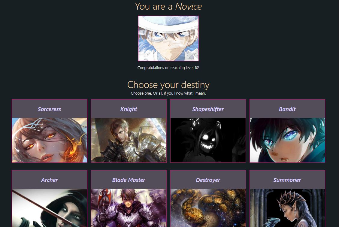
}If you've noticed throughout the tutorial there were a couple of repeated codes. Pretend you had to make a sudden adjustment to the character selection boxes, like a size adjustment. If you changed one, you'd have to scan the entire file to find the other selection boxes to make the interface consistent. Currently, the Sorceress and Knight selection boxes are identical and they need to stay in sync. But what if we added more tier2 characters into the game? You would have a bunch of repeated code, so it's a good idea to abstract that out into its own component. This brings a very important benefit: Better Customization abilities.
Here is what the code might have looked like if you abstracted out the character selection boxes:
src/App.js
const characterSelections = [
  { type: 'Sorceress', src: sorceressImg },
  { type: 'Knight', src: knightImg },
  { type: 'Shapeshifter', src: shapeshifterImg },
  { type: 'Bandit', src: banditImg },
  { type: 'Archer', src: archerImg },
  { type: 'Blade Master', src: bladeMasterImg },
  { type: 'Destroyer', src: destroyerImg },
  { type: 'Summoner', src: summonerImg },
  { type: 'Phantom', src: phantomImg },
]

const charSelectionMapper = characterSelections.reduce(
  (acc, { type, src }) => ({
    ...acc,
    [type]: src,
  }),
  {},
)

const App = () => {
  const morphRef = React.createRef()
  const morphedRef = React.createRef()
  const {
    selected,
    onSelect,
    morphing,
    morphed,
    onMorph,
    ready,
    shutdown,
  } = useLevelUpScreen({
    morphRef,
    morphedRef,
  })

  return (
    <div
      className={cx(styles.root, {
        [styles.shutdown]: shutdown,
      })}
    >
      <Header>
        You are a <em>Novice</em>
      </Header>
      <Content>
        <CharacterBox
          style={{ width: 200, height: 150 }}
          imgProps={{ src: noviceImg }}
          disableFlashing
        />
      </Content>
      <Subheader>Congratulations on reaching level 10!</Subheader>
      <div style={{ margin: '25px auto' }}>
        <Header>Choose your destiny</Header>
        <Subheader>Choose one. Or all, if you know what I mean.</Subheader>
        <Content display="grid">
          {characterSelections.map((props, index) => (
            <CharacterBox
              key={`char_selection_${index}`}
              onClick={onSelect(props.type)}
              isSelected={selected === props.type}
              {...props}
            />
          ))}
        </Content>
      </div>
      <div
        ref={morphRef}
        className={cx(styles.morph, {
          [styles.hidden]: !selected,
        })}
      >
        <MdKeyboardTab className={styles.morphArrow} />
        <button
          ref={morphRef}
          name="morph"
          type="button"
          className={styles.morph}
          style={{ opacity: morphed ? '0.4' : 1 }}
          onClick={onMorph}
          disabled={morphed}
        >
          {morphing ? 'Morphing...' : morphed ? 'Morphed' : 'Morph'}
        </button>
        <MdKeyboardTab className={styles.morphArrowFlipped} />
      </div>
      <div
        className={cx({
          [styles.morphed]: morphed,
          [styles.hidden]: !morphed,
        })}
      >
        <Header>Congratulations!</Header>
        <Content>
          <CharacterBox
            ref={morphedRef}
            type={selected}
            headerProps={{ className: styles.unique }}
            imgProps={{ src: charSelectionMapper[selected] }}
          />
        </Content>
        <Subheader>
          You have morphed into a <em>{selected}</em>
        </Subheader>
      </div>
      <div
        className={cx(styles.next, {
          [styles.hidden]: !ready,
        })}
      >
        <div>
          <RingLoader size={60} color="rgb(213, 202, 255)" loading />
          <p>Loading...</p>
        </div>
      </div>
    </div>
  )
}
src/components.js
// ...

const CharacterBox = React.forwardRef(
  (
    {
      isSelected,
      type,
      headerProps = {},
      imgProps = {},
      src,
      disableFlashing,
      ...rest
    },
    ref,
  ) => (
    <div
      ref={ref}
      className={cx(styles.characterBox, {
        [styles.selectedBox]: isSelected,
      })}
      {...rest}
    >
      {type && <h3 {...headerProps}>{type}</h3>}
      <img
        {...imgProps}
        src={src || imgProps.src}
        className={cx(styles.tier2, imgProps.className, {
          [styles.selected]: isSelected,
          [styles.noAnimation]: !!disableFlashing,
        })}
        alt=""
      />
    </div>
  ),
)
Conclusion
And that concludes the end of this article! I hope you enjoyed it and keep on the lookout for more in the future!