Build a Powerful Reusable Box Component in React

Box components are the basic foundation to composing more complex components together, allowing endless possibilities to create modern user interfaces. In this post we will be building a powerful reusable box component in react with just a few simple implementations inside the function.
Box components are one of the most basic but powerful components ever to be used in react applications. Their behavior is simple but this simplicity is the basic foundation to composing more complex components together, allowing endless possibilities to create modern user interfaces.
In this post we will be building a powerful reusable box component in react with just a few simple implementations inside the function.
Write The Foundation
The first thing we are going to do is to define our Box component with the bare minimum like so:
function Box({ children, ...props }) {
  return <div {...props}>{children}</div>
}
There are already two important things to see here:
- The element we've chosen is
div. This is the most basic element in the DOM that every reusable component needs to begin with. By default it takes an entire block. It's more intuitive if the element takes up the entire width where we need to configure it if needed rather than it being the other way around. - We destructure
childrenand manually apply it to ourBoxcomponent. I always like to do this with every component that expects children because it is a clear indication that the parent will be expecting to pass in some react node. It's also a best practice and provides more benefits to do it this way rather than passing it insidepropswhere it is mysteriously being applied. Mystery goes against the declarative nature of React.
Now we can use it in our App component:
import React from 'react'
function Box({ children, ...props }) {
return <div {...props}>{children}</div>
}
export default function App() {
return <Box>Sally Montgomery</Box>
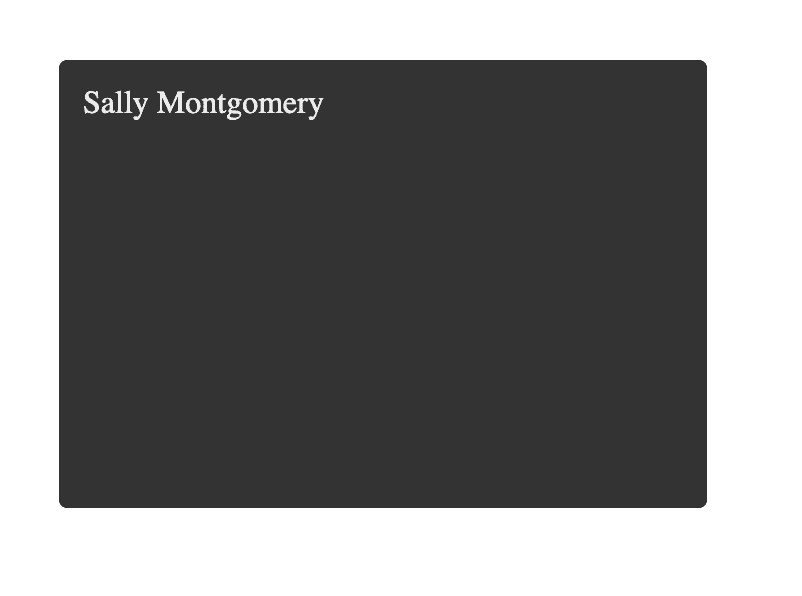
}For the sake of this tutorial we are going to pass in some styling ahead of time in the parent component so that we can clearly see what is being applied as we go along:
import React from 'react'

function Box({ children, ...props }) {
  return <div {...props}>{children}</div>
}

export default function App() {
  return (
    <Box
      style={{
        backgroundColor: '#333',
        borderRadius: 4,
        color: '#eee',
        minHeight: 200,
        padding: 12,
        width: 300,
      }}
    >
      Sally Montgomery
    </Box>
  )
}
Being the Parent for the Parent
Our reusable Box component could be finished here, but if we want to squeeze more capabilities into it without reducing its current ability in reusablility we can customize our Box implementation to accept more props and handle them without letting the parent handle them.
There are cases where the parent should handle some props, but they should be wanting to handle them such as being able to configure the style object which we already have above.
Inside our App component we applied some style props:
export default function App() {
  return (
    <Box
      style={{
        backgroundColor: '#333',
        borderRadius: 4,
        color: '#eee',
        minHeight: 200,
        padding: 12,
        width: 300,
      }}
    >
      Sally Montgomery
    </Box>
  )
}
Why did we do that? Because if we didn't our Box will look like this:
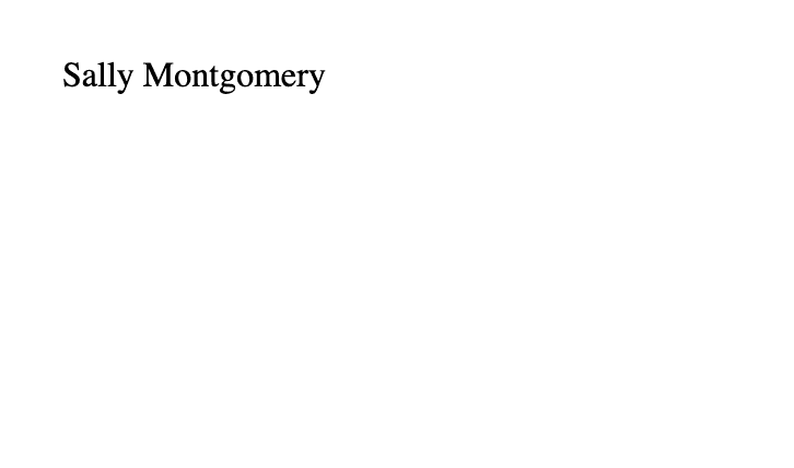
Think about it. Will every component that imports our Box component be passing in style all the time? Most likely otherwise they can just render a div element.
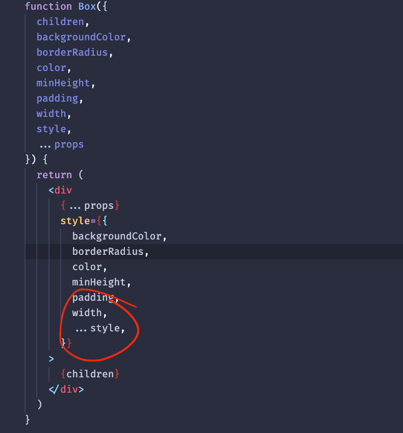
We can allow some style props to be passed through without requiring the parent to declare a style object everytime:
(note: I added in extra props that i'll be using in later in this post)
function Box({
  children,
  backgroundColor,
  border,
  borderRadius,
  color,
  overflow,
  fontFamily,
  fontSize,
  fontWeight,
  minHeight,
  margin,
  padding,
  width,
  textAlign,
  style,
  ...props
}) {
  return (
    <div
      {...props}
      style={{
        border,
        backgroundColor,
        borderRadius,
        color,
        fontFamily,
        fontSize,
        fontWeight,
        overflow,
        minHeight,
        margin,
        padding,
        width,
        textAlign,
        ...style,
      }}
    >
      {children}
    </div>
  )
}
That way our components won't have to manually pass in a whole style object to change a few styles:
export default function App() {
  return (
    <Box
      backgroundColor="#333"
      borderRadius={4}
      color="#eee"
      minHeight={200}
      padding={12}
      width={300}
    >
      Sally Montgomery
    </Box>
  )
}
We also made sure that inside our Box component we place the style prop to be last so that it can override others whenever the parent wants to:
This is a very convenient strategy that popular libraries like @chakra-ui/react do which improves the development experience (They have customized this fully which this post won't be doing because the point here is to guide users to that path).
It's quicker, easier, reduces code and boilerplate.
Lets use our Box component to create a Card:
export default function App() {
  return (
    <Box
      backgroundColor="#333"
      borderRadius={4}
      color="#eee"
      minHeight={200}
      padding={12}
      width={300}
    >
      <Box>
        <img alt="Profile" src="./images/woman.png" style={{ width: 70 }} />
      </Box>
      <Box>Sally Montgomery</Box>
      <Box>
        About me: I am a hard working individual who strives for success. I have
        a puppy named Cookie that I love very much because she always prevents
        me from falling into emotional thoughts and keeps me going.
      </Box>
      <Box></Box>
    </Box>
  )
}
(Female avatar taken from Freepik)
Looking good already! But we need to apply some spacing, font styling, and border to our female image which can be easily done because we made it easier in our Box.
Do More, Work Less
export default function App() {
  return (
    <Box
      backgroundColor="#333"
      borderRadius={4}
      color="#eee"
      minHeight={200}
      padding={20}
      width={300}
    >
      <Box
        width={80}
        border="4px solid cyan"
        backgroundColor="#fff"
        borderRadius="50%"
        overflow="hidden"
      >
        <img alt="Profile" src={woman} style={{ width: '100%' }} />
      </Box>
      <Box fontFamily="Helvetica" fontSize="1.3rem" padding="10px 0">
        Sally Montgomery
      </Box>
      <Box fontFamily="Helvetica" fontWeight={300}>
        About me: I am a hard working individual who strives for success. I have
        a puppy named Cookie that I love very much because she always prevents
        me from falling into emotional thoughts and keeps me going.
      </Box>
      <Box></Box>
    </Box>
  )
}
We can further optimize our Box component to make it even easier for parent components to work with by defaulting its props. Every application has a set of default font styles to use throughout the app, so we'll make our Box default to these props in font:
function Box({
  children,
  backgroundColor,
  border,
  borderRadius,
  color,
  overflow,
  fontFamily = 'Helvetica',
  fontSize = '1rem',
  fontWeight = 300,
  minHeight,
  margin,
  padding,
  width,
  textAlign,
  style,
  ...props
}) {
  return (
    <div
      {...props}
      style={{
        border,
        backgroundColor,
        borderRadius,
        color,
        fontFamily,
        fontSize,
        fontWeight,
        overflow,
        minHeight,
        margin,
        padding,
        width,
        textAlign,
        ...style,
      }}
    >
      {children}
    </div>
  )
}
Now we can remove some code in our App since our Box handles them by default:
export default function App() {
  return (
    <Box
      backgroundColor="#333"
      borderRadius={4}
      color="#eee"
      minHeight={200}
      padding={20}
      width={300}
    >
      <Box
        width={80}
        border="4px solid cyan"
        backgroundColor="#fff"
        borderRadius="50%"
        overflow="hidden"
      >
        <img alt="Profile" src={woman} style={{ width: '100%' }} />
      </Box>
      <Box fontSize="1.3rem" padding="10px 0">
        Sally Montgomery
      </Box>
      <Box>
        About me: I am a hard working individual who strives for success. I have
        a puppy named Cookie that I love very much because she always prevents
        me from falling into emotional thoughts and keeps me going.
      </Box>
      <Box></Box>
    </Box>
  )
}
The great thing about our Box component is that it can be composed to create more complex reusable components. That is where our reusable Box component really shines because it already abstracts basic boilerplates so they can be used everywhere without worrying about the basic necessities:
function Card({ avatar, title, children, ...rootProps }) {
  return (
    <Box
      backgroundColor="#333"
      borderRadius={4}
      color="#eee"
      minHeight={200}
      padding={20}
      width={300}
      {...rootProps}
    >
      {avatar ? (
        <Box
          width={80}
          border="4px solid cyan"
          backgroundColor="#fff"
          borderRadius="50%"
          overflow="hidden"
        >
          {avatar}
        </Box>
      ) : null}
      {title ? (
        <Box fontSize="1.3rem" padding="10px 0">
          {title}
        </Box>
      ) : null}
      {children ? <Box>{children}</Box> : null}
    </Box>
  )
}

export default function App() {
  return (
    <Card
      avatar={<img alt="Profile" src={woman} style={{ width: '100%' }} />}
      title="Sally Montgomery"
    >
      About me: I am a hard working individual who strives for success. I have a
      puppy named Cookie that I love very much because she always prevents me
      from falling into emotional thoughts and keeps me going.
    </Card>
  )
}
When Boilerplate Strikes Back. You Strike Back Harder
We can call it a day here. But if you look closely, we are starting to see Box everywhere so it eventually brings up the previous problem of writing boilerplate code again.
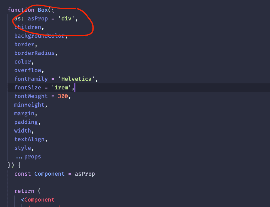
There is a powerful strategy that some react libraries take advantage of which we can use for our Box component. We can declare a parameter that allows the parent to pass in a custom react element, element tag, or component as a prop:
function Box({
  as: asProp = 'div',
  children,
  backgroundColor,
  border,
  borderRadius,
  color,
  overflow,
  fontFamily = 'Helvetica',
  fontSize = '1rem',
  fontWeight = 300,
  minHeight,
  margin,
  padding,
  width,
  textAlign,
  style,
  ...props
}) {
  const Component = asProp

  return (
    <Component
      {...props}
      style={{
        border,
        backgroundColor,
        borderRadius,
        color,
        fontFamily,
        fontSize,
        fontWeight,
        overflow,
        minHeight,
        margin,
        padding,
        width,
        textAlign,
        ...style,
      }}
    >
      {children}
    </Component>
  )
}
Less Resources
With that in place it can become handy when used in places like our Card:
Doing this provides a nice benefit: We remove one less component being created in the virtual dom. When used extensively in more components, your GPU will thank you.
Promoting Laziness
One other thing. It also enables use to apply props in lazy ways. For example below when we render our avatar props since Box can be a component we can directly take advantage of that and be super lazy like this:
const getCardAvatarProps = (avatar) => {
  return {
    as: 'img',
    width: 80,
    border: '4px solid cyan',
    backgroundColor: '#fff',
    borderRadius: '50%',
    overflow: 'hidden',
    ...(typeof avatar === 'string'
      ? { src: avatar }
      : React.isValidElement(avatar)
      ? { children: avatar }
      : avatar),
  }
}

function Card({ avatar, title, children, ...rootProps }) {
  return (
    <Box
      backgroundColor="#333"
      borderRadius={4}
      color="#eee"
      minHeight={200}
      padding={20}
      width={300}
      {...rootProps}
    >
      <Box {...getCardAvatarProps(avatar)} />>
      {title ? (
        <Box fontSize="1.3rem" padding="10px 0">
          {title}
        </Box>
      ) : null}
      {children ? <Box>{children}</Box> : null}
    </Box>
  )
}
Presets
And another useful thing we can add to our Box is to allow some set of "presets" for certain props.
For example, we can allow fontSize to be passed in as 'xl', 'lg', 'md', 'sm', or 'xs'. If none of those are provided then it will just apply the value provided. This pushes the Box even further in its capabilities in being easier to work with:
function Box({
  as: asProp = 'div',
  children,
  backgroundColor,
  border,
  borderRadius,
  color,
  mode = 'default',
  overflow,
  fontFamily = 'Helvetica',
  fontSize = '1rem',
  fontWeight = 300,
  minHeight,
  margin,
  padding,
  width,
  textAlign,
  style,
  ...props
}) {
  const Component = asProp

  let modeStyles

  if (mode === 'modal') {
    modeStyles = {
      display: 'flex',
      justifyContent: 'center',
      alignItems: 'center',
      border: '12px solid #19A8F7',
      flexDirection: 'column',
      backgroundColor: '#1F3F50',
      color: '#eee',
    }
  } else if (mode === 'card') {
    modeStyles = {
      backgroundColor: '#fff',
      color: 'rgba(0, 0, 0, 0.75)',
      paddingBottom: 30,
    }
  }

  const otherStyles = {
    border,
    backgroundColor,
    borderRadius,
    color,
    fontFamily,
    fontSize,
    fontWeight,
    overflow,
    minHeight,
    margin,
    padding,
    width,
    textAlign,
  }

  if (fontSize) {
    if (fontSize === 'xl') otherStyles.fontSize = '2rem'
    else if (fontSize === 'lg') otherStyles.fontSize = '1.5rem'
    else if (fontSize === 'md') otherStyles.fontSize = '1.2rem'
    else if (fontSize === 'sm') otherStyles.fontSize = '1rem'
    else if (fontSize === 'xs') otherStyles.fontSize = '0.8rem'
  }

  return (
    <Component
      {...props}
      style={{
        ...otherStyles,
        ...style,
        ...modeStyles,
      }}
    >
      {children}
    </Component>
  )
}
The Card component doesn't even have to know about it and could just forward props to get the benefits it provides. For example in handling the title prop it can just take in an object and call it a day:
const getCardTitleProps = (title) => {
return typeof title === 'string' ? { children: title } : title
}
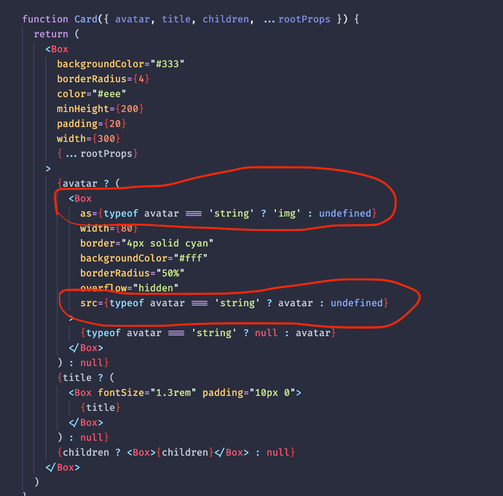
function Card({ avatar, title, children, mode, ...rootProps }) {
return (
<Box
backgroundColor="#333"
borderRadius={4}
color="#eee"
minHeight={200}
padding={20}
width={300}
mode={mode}
{...rootProps}
>
{avatar ? (
<Box
as={typeof avatar === 'string' ? 'img' : undefined}
width={80}
border="4px solid cyan"
backgroundColor="#fff"
borderRadius="50%"
overflow="hidden"
src={typeof avatar === 'string' ? avatar : undefined}
>
{typeof avatar === 'string' ? null : avatar}
</Box>
) : null}
<Box fontSize="1.3rem" padding="10px 0" {...getCardTitleProps(title)} />
{children ? <Box>{children}</Box> : null}
</Box>
)
}
Putting it together to specialize with your app
One last thing I want to mention here is what I like to do for my Box components that are specialized for my app. Its useful to create a mode prop that will switch styles according to the situation which will trigger a different "feel" to it:
function Box({
  as: asProp = 'div',
  children,
  backgroundColor,
  border,
  borderRadius,
  color,
  mode = 'default',
  overflow,
  fontFamily = 'Helvetica',
  fontSize = '1rem',
  fontWeight = 300,
  minHeight,
  margin,
  padding,
  width,
  textAlign,
  style,
  ...props
}) {
  const Component = asProp

  let modeStyles

  if (mode === 'modal') {
    modeStyles = {
      display: 'flex',
      justifyContent: 'center',
      alignItems: 'center',
      border: '12px solid #19A8F7',
      flexDirection: 'column',
      backgroundColor: '#1F3F50',
      color: '#eee',
    }
  } else if (mode === 'card') {
    modeStyles = {
      backgroundColor: '#fff',
      color: 'rgba(0, 0, 0, 0.75)',
      paddingBottom: 30,
    }
  }

  return (
    <Component
      {...props}
      style={{
        border,
        backgroundColor,
        borderRadius,
        color,
        fontFamily,
        fontSize,
        fontWeight,
        overflow,
        minHeight,
        margin,
        padding,
        width,
        textAlign,
        ...style,
        ...modeStyles,
      }}
    >
      {children}
    </Component>
  )
}
export default function App() {
return (
<Card avatar={woman} title="Sally Montgomery" mode="modal">
About me: I am a hard working individual who strives for success. I have a
puppy named Cookie that I love very much because she always prevents me
from falling into emotional thoughts and keeps me going.
</Card>
)
}Result:

export default function App() {
  return (
    <Card avatar={woman} title="Sally Montgomery" mode="card">
      About me: I am a hard working individual who strives for success. I have a
      puppy named Cookie that I love very much because she always prevents me
      from falling into emotional thoughts and keeps me going.
    </Card>
  )
}
Result:

When implementing customized styles it's best not to adjust any width/height or any positioning but allow the parent to customize those instead. Otherwise when they come across an issue like overlapping elements it can become difficult for them to have your Box inline in combination to their own components.
Conclusion
And that concludes the end of this post! I found you found this to be valuable and look out for more in the future!