Build a Stunning Breadcrumb Component in React with Plain CSS

By the end of this tutorial you should be able to learn how to create a stunning breadcrumb component in react using plain css
Have you ever browsed through a website with a personal device and found yourself wondering which part of the site you were on at the time and couldn't figure out where? Don't worry, you're not alone.
And If you did, how many users do you think had a similar experience?
This is a common scenario that developers in the web development community took is taking into consideration to improve the user experience in their web applications.
Now if you're like me, breadcrumbs is an awfully awkward term used when speaking about the interface.
If you're a first timer, let me help you clear up the potentially confused conception of a breadcrumb that you have in mind right now.
Looking at the definitions from dictionary.com, we have two official descriptions for the terminology:
- A crumb of bread, either dried or soft (Are we all talking about keeping ourselves healthy with these delicious sources of dietary fibre to help us stay efficient as web developers in the long run?)
- A sequence of text links on the current page of a website or web-based application, usually at the top, showing the page's location within a hierarchy of content or browsing history and providing a convenient navigational tool.
As you might have guessed, it was bullet point number two :)
Websites like craigslist use a breadcrumb component in their applications to describe the user's location, and in some ways it surprisingly improves their user experience!
You might have developed a navigation bar that looked like this:

Now there is nothing wrong with that, but if you did, and wondered what other things you can place in that hugely awkward empty space, a breadcrumb component can actually actually do the job quite well :)
By the end of this tutorial you should be able to learn how to create a breadcrumb component like this:
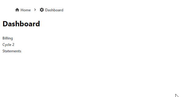
It's worth mentioning that you will be creating a breadcrumb component that will allow you to attach the logic implementation of a breadcrumb when plugged in with the component in the interface--however, implementing the logic of a breadcrumb is a little more complex. If you want to see a source code of how the logic would be implemented, you can view an example here.
Now, let's get started!
In this tutorial we are going to quickly generate a react project with create-react-app.
(If you want to get a copy of the repository from github, click here).
Go ahead and create a project using the command below. For this tutorial i’ll call our project breadcrumb.
npx create-react-app breadcrumbNow go into the directory once it's done:
cd breadcrumbInside the main entry src/index.js we're going to clean it up a bit so we can focus on the component alone:
src/index.js
import React from 'react'
import ReactDOM from 'react-dom'
import App from './App'
import './styles.css'
import * as serviceWorker from './serviceWorker'

ReactDOM.render(<App />, document.getElementById('root'))

serviceWorker.unregister()
Now create src/App.js:
src/App.js
import React from 'react'

const App = () => <div />

export default App
We will be using App.js to render the breadcrumb components. We will also use it to define some sample routes so we can see the breadcrumb in action later.
We'll go ahead and create a src/pages directory and add in the sample routes by creating each files for them:
// src/pages/home.js
import React from 'react'

const Home = ({ children }) => (
  <div>
    <h2>Home</h2>
    <div>{children}</div>
  </div>
)

export default Home

// src/pages/dashboard.js
import React from 'react'

const Dashboard = ({ children }) => (
  <div>
    <h2>Dashboard</h2>
    <div>{children}</div>
  </div>
)

export default Dashboard

// src/pages/contact.js
import React from 'react'

const Contact = ({ children }) => (
  <div>
    <h2>Contact</h2>
    <div>{children}</div>
  </div>
)

export default Contact

// src/pages/about.js
import React from 'react'

const About = ({ children }) => (
  <div>
    <h2>About</h2>
    <div>{children}</div>
  </div>
)

export default About

// src/pages/blog.js
import React from 'react'

const Blog = ({ children }) => (
  <div>
    <h2>Blog</h2>
    <div>{children}</div>
  </div>
)

export default Blog
Next, we'll go ahead and import them into our App.js component and render them inside a Router so that our breadcrumb component can act upon them. You can use any routing library, but for this tutorial i'm going to use @reach/router:
src/App.js
import React from 'react'
import { Router } from '@reach/router'
import Home from './pages/home'
import Dashboard from './pages/dashboard'
import Contact from './pages/contact'
import About from './pages/about'
import Blog from './pages/blog'

const App = () => (
  <div className='app'>
    <Router>
      <Home path='/' />
      <Dashboard path='/dashboard' />
      <Contact path='/contact' />
      <About path='/about' />
      <Blog path='/blog' />
    </Router>
  </div>
)

export default App
And here are my starting css styles:
src/styles.css
body {
  margin: 0;
  font-family: -apple-system, BlinkMacSystemFont, 'Segoe UI', 'Roboto', 'Oxygen',
    'Ubuntu', 'Cantarell', 'Fira Sans', 'Droid Sans', 'Helvetica Neue',
    sans-serif;
  -webkit-font-smoothing: antialiased;
  -moz-osx-font-smoothing: grayscale;
}

code {
  font-family: source-code-pro, Menlo, Monaco, Consolas, 'Courier New',
    monospace;
}

.app {
  padding: 12px;
}
Next we'll go ahead and create the Breadcrumb component so that we can render the breadcrumb items per route path inside:
src/Breadcrumb.js
import React from 'react'

const Breadcrumb = ({ children }) => {
  return <div>{children}</div>
}

export default Breadcrumb
Now you can import that from App.js and render it inside it's render method.
In addition I've gone ahead and defined some routes as an array so that I can render them, inside the breadcrumb component. (Note: In a real world scenario, you would provide child routes that render as the browser's location goes further down a hiearchy--but we'll just use top level routes here just to show the implementation of a breadcrumb interface in effect)
src/App.js
import React from 'react'
import { Link, Router } from '@reach/router'
import Home from './pages/home'
import Dashboard from './pages/dashboard'
import Contact from './pages/contact'
import About from './pages/about'
import Blog from './pages/blog'
import Breadcrumb from './Breadcrumb'

const items = [
  { to: '/', label: 'Home' },
  { to: '/dashboard', label: 'Dashboard' },
  { to: '/contact', label: 'Contact' },
  { to: '/about', label: 'About' },
  { to: '/blog', label: 'Blog' },
]

const App = () => (
  <div className='app'>
    <Breadcrumb>
      {items.map(({ to, label }) => (
        <Link key={to} to={to}>
          {label}
        </Link>
      ))}
    </Breadcrumb>
    <Router>
      <Home path='/' />
      <Dashboard path='/dashboard' />
      <Contact path='/contact' />
      <About path='/about' />
      <Blog path='/blog' />
    </Router>
  </div>
)

export default App
You should now see something like this:
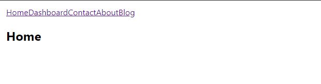
It's starting to look like a breadcrumb so far! However, at the current state this might have been sufficient in the 90s. So we have to keep thinking of ways on how to improve this better.
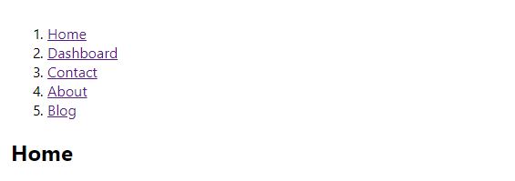
We can start by providing a wrapper around each breadcrumb item. In addition, since we're rendering these items as a list we can convert the elements used to be an ordered list so that we're being a little more formal about this:
src/Breadcrumb.js
const Breadcrumb = (props) => {
  let children = React.Children.toArray(props.children)

  children = children.map((child, index) => (
    <BreadcrumbItem key={`breadcrumb_item${index}`}>{child}</BreadcrumbItem>
  ))

  return <ol>{children}</ol>
}

export default Breadcrumb
And for the BreadcrumbItem component, we can define this at the top:
const BreadcrumbItem = ({ children, ...props }) => (
  <li className='breadcrumb-item' {...props}>
    {children}
  </li>
)
Here's what it looks like now:
Since we applied an ordered list and a list of list item elements to our breadcrumb component, we have to change the direction that the items are facing. We also need to remove the numeric characters.
We can accomplish these tasks with plain css:
src/styles.css
ol {
  list-style: none;
  display: flex;
  align-items: center;
}
An odd thing you might have noticed happening in the breadcrumb component is this line:
let children = React.Children.toArray(props.children)There's a good reason for this. When we rendered our items as the direct child of the breadcrumb component, we did this:
const App = () => (
  <div className='app'>
    <Breadcrumb>
      {items.map(({ to, label }) => (
        <Link key={to} to={to}>
          {label}
        </Link>
      ))}
    </Breadcrumb>
    <Router>
      <Home path='/' />
      <Dashboard path='/dashboard' />
      <Contact path='/contact' />
      <About path='/about' />
      <Blog path='/blog' />
    </Router>
  </div>
)
React treats each component rendered directly under it as an array as long as there are multiple components.
When we manipulate this "array" of components using various methods (such as slice), react needs a key to be passed into them each time. When we use React.Children.toArray to wrap our children, react automatically assigns and handles all of the key requirements to the original children for subsequent uses. Perfect! We don't have to apply unnecessary ugly code to our component code. Thank you React :)
Breadcrumbs often use a separator to separate each one of their items so that they are easier to use and read for users. When you apply a separator (most commonly a slash like "/") users will be able to tell which parts are separate from one another. Sometimes--on some screens, you'd find your words unexpectedly too close to one another, so this helps with those visibility issues.
Next we'll go ahead and add a .reduce to the children so that we can apply the logic to get these separators in place:
src/Breadcrumb.js
import React from 'react'

const BreadcrumbItem = ({ children, ...props }) => (
  <li className='breadcrumb-item' {...props}>
    {children}
  </li>
)

const Breadcrumb = (props) => {
  let children = React.Children.toArray(props.children)

  children = children.map((child, index) => (
    <BreadcrumbItem key={`breadcrumb_item${index}`}>{child}</BreadcrumbItem>
  ))

  const lastIndex = children.length - 1

  children = children.reduce((acc, child, index) => {
    const notLast = index < lastIndex
    if (notLast) {
      acc.push(child, '/')
    } else {
      acc.push(child)
    }
    return acc
  }, [])

  return <ol>{children}</ol>
}

export default Breadcrumb
(Note: We implemented a conditional check so that we don't unnecessarily render a trailing slash at the end of the breadcrumb)
From the screenshot we can definitely see that we separated each breadcrumb item. However, going back to my previous comment about some users not being able to see words clearly due to how close the words can become in some screens, the same issue now reappeared with the separators.
So we're going to apply a wrapper for the separator and attach a className prop right on the li element so we can manipulate the spacing a bit:
src/Breadcrumb.js
const BreadcrumbSeparator = ({ children, ...props }) => (
  <li className='breadcrumb-separator' {...props}>
    {children}
  </li>
)
src/styles.css
.breadcrumb-separator {
  color: #333;
  margin: auto 6px;
  user-select: none;
}
And now, we simply just need to wrap our separator with the new wrapper component:
children = children.reduce((acc, child, index) => {
    const notLast = index < lastIndex
    if (notLast) {
      acc.push(
        child,
        <BreadcrumbSeparator key={`breadcrumb_sep${index}`}>
          /
        </BreadcrumbSeparator>,
      )
    } else {
      acc.push(child)
    }
    return acc
  }, [])
Perfect!
Sometimes however, as a developer we might want to switch up what kind of separator to use--such as an arrow. We can give the option to customize that by allowing the caller to pass in a custom separator as a prop:
src/Breadcrumb.js
const Breadcrumb = ({ separator = '/', ...props }) => {
  let children = React.Children.toArray(props.children)

  children = children.map((child, index) => (
    <BreadcrumbItem key={`breadcrumb_item${index}`}>{child}</BreadcrumbItem>
  ))

  const lastIndex = children.length - 1

  children = children.reduce((acc, child, index) => {
    const notLast = index < lastIndex
    if (notLast) {
      acc.push(
        child,
        <BreadcrumbSeparator key={`breadcrumb_sep${index}`}>
          {separator}
        </BreadcrumbSeparator>,
      )
    } else {
      acc.push(child)
    }
    return acc
  }, [])

  return <ol>{children}</ol>
}
src/App.js
const App = () => (
  <div className='app'>
    <Breadcrumb separator='/'>
      {items.map(({ to, label }) => (
        <Link key={to} to={to}>
          {label}
        </Link>
      ))}
    </Breadcrumb>
    <Router>
      <Home path='/' />
      <Dashboard path='/dashboard' />
      <Contact path='/contact' />
      <About path='/about' />
      <Blog path='/blog' />
    </Router>
  </div>
)
src/App.js
const Separator = ({ children, ...props }) => (
  <span style={{ color: 'teal' }} {...props}>
    {children}
  </span>
)

const items = [
  { to: '/', label: 'Home' },
  { to: '/dashboard', label: 'Dashboard' },
  { to: '/contact', label: 'Contact' },
  { to: '/about', label: 'About' },
  { to: '/blog', label: 'Blog' },
]

const App = () => (
  <div className='app'>
    <Breadcrumb separator={<Separator>/</Separator>}>
      {items.map(({ to, label }) => (
        <Link key={to} to={to}>
          {label}
        </Link>
      ))}
    </Breadcrumb>
    <Router>
      <Home path='/' />
      <Dashboard path='/dashboard' />
      <Contact path='/contact' />
      <About path='/about' />
      <Blog path='/blog' />
    </Router>
  </div>
)
What happens when a breadcrumb can get too long?
Most commonly in a large scaled application there can be an abundant amount of routes that can make a breadcrumb longer than it should be.
If we want to combat that, a known solution is to use a collapser.
We'll go ahead and create a collapser component.
Go ahead and create src/BreadcrumbCollapser.js. This will be used to collapse items from the interface so that the breadcrumb component can hide some of its items:
src/BreadcrumbCollapser.js
import React from 'react'
import { MdMoreHoriz } from 'react-icons/md'

const BreadcrumbCollapser = (props) => (
  <li className='breadcrumb-collapser' {...props}>
    <MdMoreHoriz />
  </li>
)

export default BreadcrumbCollapser
src/styles.css
.breadcrumb-separator {
  color: #333;
  margin: auto 6px;
  user-select: none;
}

.breadcrumb-collapser {
  display: flex;
  align-items: center;
}

.breadcrumb-collapser svg {
  cursor: pointer;
  transition: all 0.2s ease-out;
  color: #000;
  width: 25px;
  height: 25px;
}
.breadcrumb-collapser svg:hover,
.breadcrumb-collapser svg:focus {
  color: #999;
  transform: scale(1.15);
}

.breadcrumb-collapser svg:active {
  color: #333;
}
When we introduce any form of a "collapser", we need it to know when or when not to collapse, and having the user the ability to control that behavior is a great way to enhance the user experience of a collapser.
I'm going to create a custom hook called useBreadcrumb.js and set a state called expanded. The interface is going to need this information, so it is returned from the custom hook:
src/useBreadcrumb.js
import { useState } from 'react'

const useBreadcrumb = () => {
  const [expanded, setExpanded] = useState(false)

  const open = () => setExpanded(true)

  return {
    expanded,
    open,
  }
}

export default useBreadcrumb
Creating a custom react hook in a separate file might be a little overkill, but I like the extra organizational habits it brings to my development flow :) It's entirely optional and you can instead just set the state directly in the breadcrumb component.
Next, I imported both the custom hook and the breadcrumb collapser from the Breadcrumb.js file:
src/Breadcrumb.js
import React from 'react'
import useBreadcrumb from './useBreadcrumb'
import BreadcrumbCollapser from './BreadcrumbCollapser'
Using the custom hook:
const Breadcrumb = ({ separator, ...props }) => {
  let children = React.Children.toArray(props.children)

  const { expanded, open } = useBreadcrumb()
It's probably helpful to provide a custom prop that the caller can pass in to control the amount of items that are collapsed or shown, so we allow the caller to pass in a custom collapse prop that we can use to apply to the breadcrumb collapser:
const Breadcrumb = ({ separator, collapse = {}, ...props }) => {
  let children = React.Children.toArray(props.children)

  const { expanded, open } = useBreadcrumb()

  const { itemsBefore = 1, itemsAfter = 1, max = 4 } = collapse

  const totalItems = children.length
  const lastIndex = totalItems - 1
This will ensure that the caller has the ability to control what to see, tailoring it to be a little more compatible for their UI if needed.
And finally, applying the collapser to the rendering children:
if (!expanded || totalItems <= max) {
  children = [
    ...children.slice(0, itemsBefore),
    <BreadcrumbCollapser
      title='Expand'
      key='collapsed-seperator'
      onClick={open}
    />,
    ...children.slice(totalItems - itemsAfter, totalItems),
  ]
}
Here is our entire breadcrumb implementation so far:
src/Breadcrumb.js
import React from 'react'
import useBreadcrumb from './useBreadcrumb'
import BreadcrumbCollapser from './BreadcrumbCollapser'

const BreadcrumbItem = ({ children, ...props }) => (
  <li className='breadcrumb-item' {...props}>
    {children}
  </li>
)

const BreadcrumbSeparator = ({ children, ...props }) => (
  <li className='breadcrumb-separator' {...props}>
    {children}
  </li>
)

const Breadcrumb = ({ separator, collapse = {}, ...props }) => {
  let children = React.Children.toArray(props.children)

  const { expanded, open } = useBreadcrumb()

  const { itemsBefore = 1, itemsAfter = 1, max = 4 } = collapse

  const totalItems = children.length
  const lastIndex = totalItems - 1

  children = children.map((child, index) => (
    <BreadcrumbItem key={`breadcrumb_item${index}`}>{child}</BreadcrumbItem>
  ))

  children = children.reduce((acc, child, index) => {
    const notLast = index < lastIndex
    if (notLast) {
      acc.push(
        child,
        <BreadcrumbSeparator key={`breadcrumb_sep${index}`}>
          {separator}
        </BreadcrumbSeparator>,
      )
    } else {
      acc.push(child)
    }
    return acc
  }, [])

  if (!expanded || totalItems <= max) {
    children = [
      ...children.slice(0, itemsBefore),
      <BreadcrumbCollapser
        title='Expand'
        key='collapsed-seperator'
        onClick={open}
      />,
      ...children.slice(totalItems - itemsAfter, totalItems),
    ]
  }

  return <ol>{children}</ol>
}

export default Breadcrumb
The links need a little bit of customization since they're pretty basic and old. Let's change that:
a {
  text-decoration: none;
  font-weight: 400;
  color: #424548;
}

a:hover {
  color: #1da2b3;
}
If you're more of the functional type of person and our component isn't very appealing to you, it's perfectly fine to refactor it to be a little more appealing:
src/Breadcrumb.js
const toBreadcrumbItem = (child, index) => (
  <BreadcrumbItem key={`breadcrumb_item${index}`}>{child}</BreadcrumbItem>
)

const withSeparator = (lastIndex, separator) => (acc, child, index) => {
  const notLast = index < lastIndex
  if (notLast) {
    acc.push(
      child,
      <BreadcrumbSeparator key={`breadcrumb_sep${index}`}>
        {separator}
      </BreadcrumbSeparator>,
    )
  } else {
    acc.push(child)
  }
  return acc
}

const withCollapse = ({
  itemsBefore,
  itemsAfter,
  max,
  children,
  totalItems,
  open,
}) => [
  ...children.slice(0, itemsBefore),
  <BreadcrumbCollapser
    title='Expand'
    key='collapsed-seperator'
    onClick={open}
  />,
  ...children.slice(totalItems - itemsAfter, totalItems),
]
const Breadcrumb = ({ separator, collapse = {}, ...props }) => {
let children = React.Children.toArray(props.children)
const { expanded, open } = useBreadcrumb()
const { itemsBefore = 1, itemsAfter = 1, max = 4 } = collapse
const totalItems = children.length
const lastIndex = totalItems - 1
children = children
.map(toBreadcrumbItem)
.reduce(withSeparator(lastIndex, separator), [])
if (!expanded || totalItems <= max) {
children = withCollapse({
itemsBefore,
itemsAfter,
max,
children,
totalItems,
open,
})
}
return <ol>{children}</ol>
}
Something to keep in mind here is that if we didn't use React.Children.toArray to wrap our children, we'd be getting key errors in the console for the rendering children lists without providing a key to them.
Wondering how to render icons in between? There are multiple ways to achieve this but one way would be something like:
src/App.js
import React from 'react'
import { Link, Router } from '@reach/router'
import { MdHome, MdSettings, MdEmail, MdInfo, MdWeb } from 'react-icons/md'
import Home from './pages/home'
import Dashboard from './pages/dashboard'
import Contact from './pages/contact'
import About from './pages/about'
import Blog from './pages/blog'
import Breadcrumb from './Breadcrumb'

const Separator = ({ children, ...props }) => (
  <span style={{ color: 'teal' }} {...props}>
    {children}
  </span>
)

const options = {
  icons: {
    Home: MdHome,
    Dashboard: MdSettings,
    Contact: MdEmail,
    About: MdInfo,
    Blog: MdWeb,
  },
  items: [
    { to: '/', label: 'Home' },
    { to: '/dashboard', label: 'Dashboard' },
    { to: '/contact', label: 'Contact' },
    { to: '/about', label: 'About' },
    { to: '/blog', label: 'Blog' },
  ],
}

const App = () => (
  <div className='app'>
    <Breadcrumb separator={<Separator>/</Separator>}>
      {options.items.map(({ to, label }) => {
        const Icon = options.icons[label]
        return (
          <div key={to} className='some-custom-classname'>
            {Icon && <Icon />}
            <Link to={to}>{label}</Link>
          </div>
        )
      })}
    </Breadcrumb>
    <Router>
      <Home path='/' />
      <Dashboard path='/dashboard' />
      <Contact path='/contact' />
      <About path='/about' />
      <Blog path='/blog' />
    </Router>
  </div>
)

export default App


And finally, I mentioned earlier that in a real world scenario we would have child routes being rendered in the breadcrumb component--through a hierarchy. In this tutorial we used top level routes (which isn't ideal but I wanted to show how the interface could be implemented).
A more real approach to the interface can be achieved using the tactics in this tutorial:
Beautiful!
Conclusion
And that concludes the end of this tutorial! If you've been reading my previous posts you probably have realized that I don't say much in the conclusion--because everything was already said above! :)
See you guys next time and look out for more quality posts!