How To Maximize Reusability For Your React Components
April 14th, 2020

Share This Post
React is a popular library that developers can use to build highly complex and interactive user interfaces for web applications. Many developers that utilize this library to build their apps also simply find it fun to use for many great reasons. For example, its declarative nature makes it less painful and more entertaining to build web apps because code can become predictable and more controllable in our power.
So what makes it less painful then, and what are some examples that can help demonstrate how react can be used to build highly complex and interactive user interfaces?
This article will go over maximizing the capabilities of reusability in react and provide some tips and tricks you can use on your react app today. It will be demonstrated by building an actual react component and explaining step by step on why some steps are taken and what can be done to improve the reusability on them. I would like to stress that there are plenty of ways to make a component reusable and while this post will explain important ways to do this, it does not cover all of them!
This post is for beginners, intermediate and advanced react developers--although it will be more useful to beginners and intermediate developers.
Without further ado, let's begin!
The Component
Let's build a list component and try to expand its capabilities from there.
Pretend that we're building a page where users are redirected to after they registered to become part of a community of medical professionals. The page should show lists of groups that doctors can create where newly registered doctors can view. Each list should show some type of title, description, the creator of the group, an image that represents their group, and some basic essential information like dates.
We can just create a simple list component that represents a group like this:
function List(props) {
  return (
    <div>
      <h5>
        Group: <em>Pediatricians</em>
      </h5>
      <ul>
        <p>Members</p>
        <li>Michael Lopez</li>
        <li>Sally Tran</li>
        <li>Brian Lu</li>
        <li>Troy Sakulbulwanthana</li>
        <li>Lisa Wellington</li>
      </ul>
    </div>
  )
}
Then we can easily just render it and call it a day:
import React from 'react'
import List from './List'

function App() {
  return <List />
}

export default App
Obviously the component isn't re-usable, so we can solve that issue by providing some basic reusability through props by children:
function List(props) {
  return <div>{props.children}</div>
}
function App() {
return (
<List>
<h5>
Group: <em>Pediatricians</em>
</h5>
<ul>
<p>Members</p>
<li>Michael Lopez</li>
<li>Sally Tran</li>
<li>Brian Lu</li>
<li>Troy Sakulbulwanthana</li>
<li>Lisa Wellington</li>
</ul>
</List>
)
}But that doesn't make much sense, because the List component isn't even a list component anymore nor should it even be named a list because it's just now a component that returns a div element. We might as well just have moved the code right into the App component. But that's bad because now we have the component hard coded into App. This might have been okay if we're sure that the list is a one-time use. But we know there will be multiple because we're using it to render different medical groups on our web page.
So we can refactor List to provide more narrower props for its list elements:
function List({ groupName, members = [] }) {
  return (
    <div>
      <h5>
        Group: <em>{groupName}</em>
      </h5>
      <ul>
        <p>Members</p>
        {members.map((member) => (
          <li key={member}>{member}</li>
        ))}
      </ul>
    </div>
  )
}
This looks a little better, and now we can re-use the List like so:
import React from 'react'
import './styles.css'

function App() {
  const pediatricians = [
    'Michael Lopez',
    'Sally Tran',
    'Brian Lu',
    'Troy Sakulbulwanthana',
    'Lisa Wellington',
  ]

  const psychiatrists = [
    'Miguel Rodriduez',
    'Cassady Campbell',
    'Mike Torrence',
  ]

  return (
    <div className="root">
      <div className="listContainer">
        <List groupName="Pediatricians" members={pediatricians} />
      </div>
      <div className="listContainer">
        <List groupName="Psychiatrists" members={psychiatrists} />
      </div>
    </div>
  )
}

export default App
There's not much here to the styles, but here they are to avoid confusion:
.root {
  display: flex;
}

.listContainer {
  flex-grow: 1;
}
A small app constrained to just this web page can probably just get by with this simple component. But what if we were dealing with potentially large datasets where the list needs to render hundreds of rows? We would end up with the page attempting to display all of them, which can introduce issues like crashing, lag, elements being out of place or overlapping, etc.
This isn't a great user experience, so we can provide a way to expand the list when the amount of members hits a certain count:
function List({ groupName, members = [] }) {
  const [collapsed, setCollapsed] = React.useState(members.length > 3)

  const constrainedMembers = collapsed ? members.slice(0, 3) : members

  function toggle() {
    setCollapsed((prevValue) => !prevValue)
  }

  return (
    <div>
      <h5>
        Group: <em>{groupName}</em>
      </h5>
      <ul>
        <p>Members</p>
        {constrainedMembers.map((member) => (
          <li key={member}>{member}</li>
        ))}
        {members.length > 3 && (
          <li className="expand">
            <button type="button" onClick={toggle}>
              Expand
            </button>
          </li>
        )}
      </ul>
    </div>
  )
}
.root {
  display: flex;
}

.listContainer {
  flex-grow: 1;
  box-sizing: border-box;
  width: 100%;
}

li.expand {
  list-style-type: none;
}

button {
  border: 0;
  border-radius: 4px;
  padding: 5px 10px;
  outline: none;
  cursor: pointer;
}

button:active {
  color: rgba(0, 0, 0, 0.75);
}
It seems like we got a pretty good reusable component for rendering lists of groups now.
We can absolutely do better. We don't really have to use this component specifically for groups of an organization.
What if we can use it for other purposes? Providing a prop for the label (which in our case is Group:) can logically make that happen:
function List({ label, groupName, members = [] }) {
  const [collapsed, setCollapsed] = React.useState(members.length > 3)

  const constrainedMembers = collapsed ? members.slice(0, 3) : members

  function toggle() {
    setCollapsed((prevValue) => !prevValue)
  }

  return (
    <div>
      <h5>
        {label}: <em>{groupName}</em>
      </h5>
      <ul>
        <p>Members</p>
        {constrainedMembers.map((member) => (
          <li key={member}>{member}</li>
        ))}
        {members.length > 3 && (
          <li className="expand">
            <button type="button" onClick={toggle}>
              Expand
            </button>
          </li>
        )}
      </ul>
    </div>
  )
}
You can then use it for other purposes:
function App() {
  return (
    <div className="root">
      <div className="listContainer">
        <List
          groupName="customerSupport"
          members={['Lousie Yu', 'Morgan Kelly']}
        />
      </div>
    </div>
  )
}
When thinking about how to make react components more reusable, a simple but powerful approach is to re-think how your prop variables are named. Most of the time a simple a rename can make a huge difference.
So in our App component we can also provide a custom prop for the Members part:
function List({ label, labelValue, sublabel, members = [] }) {
const [collapsed, setCollapsed] = React.useState(members.length > 3)
const constrainedMembers = collapsed ? members.slice(0, 3) : members
function toggle() {
setCollapsed((prevValue) => !prevValue)
}
return (
<div>
<h5>
{label}: <em>{labelValue}</em>
</h5>
<ul>
<p>{sublabel}</p>
{constrainedMembers.map((member) => (
<li key={member}>{member}</li>
))}
{members.length > 3 && (
<li className="expand">
<button type="button" onClick={toggle}>
Expand
</button>
</li>
)}
</ul>
</div>
)
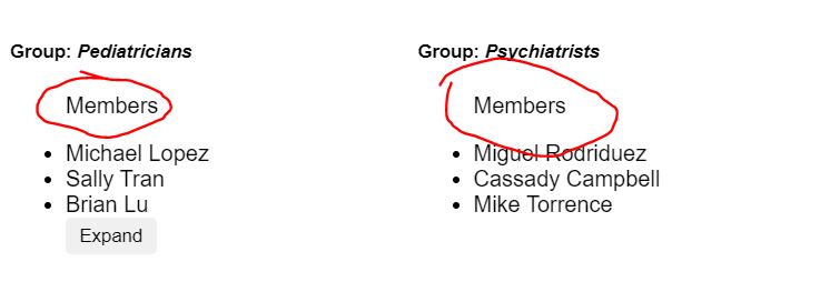
}Now if we look at our component and only provide the members prop, let's look at what we get:

I don't know about you, but what I see here is that the list can actually be used for anything!
We can reuse the same component to represent patents waiting in line for their next appointment:

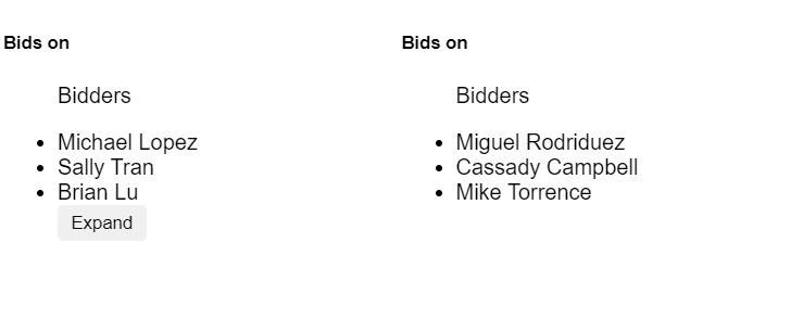
Or we can use it on bidding auctions:

Do not underestimate the power of naming variables. A simple naming fix can become a game changer.
Lets go back to the code. We did pretty good on expanding its reusability. But in my perspective we can actually do a lot more.
So now that we know our List component can be compatible to be reused for totally unrelated reasons, we can now decide that we can break up pieces of the component into subcomponents to support different use cases like so:
function ListRoot({ children, ...rest }) {
  return <div {...rest}>{children}</div>
}

function ListHeader({ children }) {
  return <h5>{children}</h5>
}

function ListComponent({ label, items = [], limit = 0 }) {
  const [collapsed, setCollapsed] = React.useState(items.length > 3)

  function toggle() {
    setCollapsed((prevValue) => !prevValue)
  }

  const constrainedItems = collapsed ? items.slice(0, limit) : items

  return (
    <ul>
      <p>{label}</p>
      {constrainedItems.map((member) => (
        <li key={member}>{member}</li>
      ))}
      {items.length > limit && (
        <li className="expand">
          <button type="button" onClick={toggle}>
            Expand
          </button>
        </li>
      )}
    </ul>
  )
}

function List({ header, label, members = [], limit }) {
  return (
    <ListRoot>
      <ListHeader>{header}</ListHeader>
      <ListComponent label={label} items={members} limit={limit} />
    </ListRoot>
  )
}
Functionally it works the same way, but now we split different elements into list subcomponents.
This provided some neat benefits:
- We can now test each component separately
- It becomes more scalable (Maintenance, code size)
- It becomes more readable even when code becomes larger
- Optimize each component with memoization using techniques like
React.memo
Notice that the majority of the implementation details stayed the same but it's now more reusable.
You might have noticed that the collapsed state was moved into ListComponent. We can easily make the ListComponent reusable by moving the state control back to the parent through props:
function ListComponent({ label, items = [], collapsed, toggle, limit, total }) {
  return (
    <ul>
      <p>{label}</p>
      {items.map((member) => (
        <li key={member}>{member}</li>
      ))}
      {total > limit && (
        <li className="expand">
          <button type="button" onClick={toggle}>
            {collapsed ? 'Expand' : 'Collapse'}
          </button>
        </li>
      )}
    </ul>
  )
}

function List({ header, label, items = [], limit = 3 }) {
  const [collapsed, setCollapsed] = React.useState(items.length > limit)

  function toggle() {
    setCollapsed((prevValue) => !prevValue)
  }

  return (
    <ListRoot>
      <ListHeader>{header}</ListHeader>
      <ListComponent
        label={label}
        items={
          collapsed && items.length > limit ? items.slice(0, limit) : items
        }
        collapsed={collapsed}
        toggle={toggle}
        limit={limit}
        total={items.length}
      />
    </ListRoot>
  )
}
Knowing that ListComponent became more reusable by providing the collapse state management through props, we can do the same for List so that developers that use our component have the power to control it:
function App() {
  const [collapsed, setCollapsed] = React.useState(true)

  function toggle() {
    setCollapsed((prevValue) => !prevValue)
  }

  const pediatricians = [
    'Michael Lopez',
    'Sally Tran',
    'Brian Lu',
    'Troy Sakulbulwanthana',
    'Lisa Wellington',
  ]

  const psychiatrists = [
    'Miguel Rodriduez',
    'Cassady Campbell',
    'Mike Torrence',
  ]

  const limit = 3

  return (
    <div className="root">
      <div className="listContainer">
        <List
          collapsed={collapsed}
          toggle={toggle}
          header="Bids on"
          label="Bidders"
          items={pediatricians}
          limit={limit}
        />
      </div>
      <div className="listContainer">
        <List header="Bids on" label="Bidders" items={psychiatrists} />
      </div>
    </div>
  )
}
function List({ collapsed, toggle, header, label, items = [], limit = 3 }) {
return (
<ListRoot>
<ListHeader>{header}</ListHeader>
<ListComponent
label={label}
items={
collapsed && items.length > limit ? items.slice(0, limit) : items
}
collapsed={collapsed}
toggle={toggle}
limit={limit}
total={items.length}
/>
</ListRoot>
)
}
We're starting to see a pattern emerge here. It seems like props has a lot to do with reusability--and that's exactly right!
In practice it's not uncommon that developers want to override an implementation of a subcomponent to provide their own component. We can make our List component to allow that by providing an overrider from props as well:
function List({
  collapsed,
  toggle,
  header,
  label,
  items = [],
  limit = 3,
  renderHeader,
  renderList,
}) {
  return (
    <ListRoot>
      {renderHeader ? renderHeader() : <ListHeader>{header}</ListHeader>}
      {renderList ? (
        renderList()
      ) : (
        <ListComponent
          label={label}
          items={
            collapsed && items.length > limit ? items.slice(0, limit) : items
          }
          collapsed={collapsed}
          toggle={toggle}
          limit={limit}
          total={items.length}
        />
      )}
    </ListRoot>
  )
}
This is a very common but powerful pattern used in many react libraries. In the midst of reusability, its very important to always have default implementations in place. For example, if a developer wanted to override the ListHeader he can provide his own implementation by passing in renderHeader, otherwise it will default to rendering the original ListHeader. This is to keep the list component staying functionally the same and unbreakable.
But even when you provide default implementations if an overrider isn't being used, it's also good to provide a way to remove or hide something in the componenet as well.
For example, if we want to provide a way for a developer to not render any header element at all, its a useful tactic to provide a "switch" for that through props. We don't want to pollute the namespace in props so we can re-use the header prop so that if they pass in null it can just not render the list header at all:
function List({
  collapsed,
  toggle,
  header,
  label,
  items = [],
  limit = 3,
  renderHeader,
  renderList,
}) {
  return (
    <ListRoot>
      {renderHeader ? (
        renderHeader()
      ) : // HERE
      header !== null ? (
        <ListHeader>{header}</ListHeader>
      ) : null}

      {renderList ? (
        renderList()
      ) : (
        <ListComponent
          label={label}
          items={
            collapsed && items.length > limit ? items.slice(0, limit) : items
          }
          collapsed={collapsed}
          toggle={toggle}
          limit={limit}
          total={items.length}
        />
      )}
    </ListRoot>
  )
}<List
collapsed={collapsed}
toggle={toggle}
header={null} // Using the switch
label="Bidders"
items={pediatricians}
limit={limit}
/>
We can still go further with our reusable List component. We aren't constrained to providing overriders for the ListHeader and ListComponent. We can also provide a way for them to override the root component like so:
function List({
  component: RootComponent = ListRoot,
  collapsed,
  toggle,
  header,
  label,
  items = [],
  limit = 3,
  renderHeader,
  renderList,
}) {
  return (
    <RootComponent>
      {renderHeader ? (
        renderHeader()
      ) : header !== null ? (
        <ListHeader>{header}</ListHeader>
      ) : null}
      {renderList ? (
        renderList()
      ) : (
        <ListComponent
          label={label}
          items={
            collapsed && items.length > limit ? items.slice(0, limit) : items
          }
          collapsed={collapsed}
          toggle={toggle}
          limit={limit}
          total={items.length}
        />
      )}
    </RootComponent>
  )
}
Remember that when we provide customizable options like these that we always default to a default implementation, just as we defaulted it to use the original ListRoot component.
Now the parent can easily provide their own fashionable container component that renders the List as its children:
function App() {
  const [collapsed, setCollapsed] = React.useState(true)

  function toggle() {
    setCollapsed((prevValue) => !prevValue)
  }

  const pediatricians = [
    'Michael Lopez',
    'Sally Tran',
    'Brian Lu',
    'Troy Sakulbulwanthana',
    'Lisa Wellington',
  ]

  const psychiatrists = [
    'Miguel Rodriduez',
    'Cassady Campbell',
    'Mike Torrence',
  ]

  const limit = 3

  function BeautifulListContainer({ children }) {
    return (
      <div
        style={{
          background: 'teal',
          padding: 12,
          borderRadius: 4,
          color: '#fff',
        }}
      >
        {children}
        Today is: {new Date().toDateString()}
      </div>
    )
  }

  return (
    <div className="root">
      <div className="listContainer">
        <List
          component={BeautifulListContainer}
          collapsed={collapsed}
          toggle={toggle}
          header={null}
          label="Bidders"
          items={pediatricians}
          limit={limit}
        />
      </div>
      <div className="listContainer">
        <List header="Bids on" label="Bidders" items={psychiatrists} />
      </div>
    </div>
  )
}
Sometimes developers also want to provide their own list rows, so using the same concepts we went over throughout this post we can make that happen. First lets abstract out the li elements into their own ListItem component:
function ListComponent({ label, items = [], collapsed, toggle, limit, total }) {
  return (
    <ul>
      <p>{label}</p>
      {items.map((member) => (
        <ListItem key={member}>{member}</ListItem>
      ))}
      {total > limit && (
        <ListItem className="expand">
          <button type="button" onClick={toggle}>
            {collapsed ? 'Expand' : 'Collapse'}
          </button>
        </ListItem>
      )}
    </ul>
  )
}

function ListItem({ children, ...rest }) {
  return <li {...rest}>{children}</li>
}
Then change the List to provide a customizable renderer to override the default ListItem:
function List({
  component: RootComponent = ListRoot,
  collapsed,
  toggle,
  header,
  label,
  items = [],
  limit = 3,
  renderHeader,
  renderList,
  renderListItem,
}) {
  return (
    <RootComponent>
      {renderHeader ? (
        renderHeader()
      ) : header !== null ? (
        <ListHeader>{header}</ListHeader>
      ) : null}
      {renderList ? (
        renderList()
      ) : (
        <ListComponent
          label={label}
          items={
            collapsed && items.length > limit ? items.slice(0, limit) : items
          }
          collapsed={collapsed}
          toggle={toggle}
          limit={limit}
          total={items.length}
          renderListItem={renderListItem}
        />
      )}
    </RootComponent>
  )
}
And slightly modify the ListComponent to support that customization:
function ListComponent({
  label,
  items = [],
  collapsed,
  toggle,
  limit,
  total,
  renderListItem,
}) {
  return (
    <ul>
      <p>{label}</p>
      {items.map((member) =>
        renderListItem ? (
          <React.Fragment key={member}>{renderListItem({ collapsed, toggle, member )}</React.Fragment>
        ) : (
          <ListItem key={member}>{member}</ListItem>
        ),
      )}
      {total > limit && (
        <ListItem className='expand'>
          <button type='button' onClick={toggle}>
            {collapsed ? 'Expand' : 'Collapse'}
          </button>
        </ListItem>
      )}
    </ul>
  )
}
Note: We wrapped the call to renderListItem(member) in a React.Fragment so that we can handle assigning the key for them so that they don't have to. This simple change can make the difference in getting positive reviews from users who try our component because it would save them the hassle of having to handle that themselves.
As a react developer, I still see a lot of more open opportunities to maximize our List component's reusability to its full potential. But since the post is getting too long at this point, i'll finish it off with a couple more to start you off on your journey :)
I would like to emphasize that its important we take advantage of the renderer props like renderListItem or renderHeader to pass arguments back to the caller. This is a powerful pattern and it's the reason why the render prop pattern became widely adopted before react hooks was released.
Going back to naming our prop variables, we can come to realize that this component actually doesn't need to represent a list every time. We can actually make this compatible for many different situations and not just for rendering lists! What we really need to pay attention to is how the component is implemented in code.
All it's essentially doing is taking a list of items and rendering them, while supporting fancy features like collapsing. It may feel as if the collapsing part is only unique to dropdowns, lists, menus, etc. But anything can be collapsed! Anything in our component is not only specific to these components.
For example, we can easily reuse the component for a navbar:

Our component is essentially the same as before except we provided a couple more props like renderCollapser and renderExpander:
function ListComponent({
  label,
  items = [],
  collapsed,
  toggle,
  limit,
  total,
  renderListItem,
  renderCollapser,
  renderExpander,
}) {
  let expandCollapse

  if (total > limit) {
    if (collapsed) {
      expandCollapse = renderExpander ? (
        renderExpander({ collapsed, toggle })
      ) : (
        <button type="button" onClick={toggle}>
          Expand
        </button>
      )
    } else {
      expandCollapse = renderCollapser ? (
        renderCollapser({ collapsed, toggle })
      ) : (
        <button type="button" onClick={toggle}>
          Collapse
        </button>
      )
    }
  }

  return (
    <ul>
      <p>{label}</p>
      {items.map((member) =>
        renderListItem ? (
          <React.Fragment key={member}>
            {renderListItem({ collapsed, toggle, member })}
          </React.Fragment>
        ) : (
          <ListItem key={member}>{member}</ListItem>
        ),
      )}
      {total > limit && (
        <ListItem className="expand">{expandCollapse}</ListItem>
      )}
    </ul>
  )
}

function ListItem({ children, ...rest }) {
  return <li {...rest}>{children}</li>
}

function List({
  component: RootComponent = ListRoot,
  collapsed,
  toggle,
  header,
  label,
  items = [],
  limit = 3,
  renderHeader,
  renderList,
  renderListItem,
  renderCollapser,
  renderExpander,
}) {
  return (
    <RootComponent>
      {renderHeader ? (
        renderHeader()
      ) : header !== null ? (
        <ListHeader>{header}</ListHeader>
      ) : null}
      {renderList ? (
        renderList()
      ) : (
        <ListComponent
          label={label}
          items={
            collapsed && items.length > limit ? items.slice(0, limit) : items
          }
          collapsed={collapsed}
          toggle={toggle}
          limit={limit}
          total={items.length}
          renderListItem={renderListItem}
          renderCollapser={renderCollapser}
          renderExpander={renderExpander}
        />
      )}
    </RootComponent>
  )
}
function App() {
const [collapsed, setCollapsed] = React.useState(true)
function toggle() {
setCollapsed((prevValue) => !prevValue)
}
const pediatricians = ['Home', 'Posts', 'About', 'More', 'Contact', 'FAQ']
const limit = 3
function renderCollapser({ collapsed, toggle }) {
return <ChevronLeftIcon onClick={toggle} />
}
function renderExpander({ collapsed, toggle }) {
return <ChevronRightIcon onClick={toggle} />
}
function renderListItem({ collapsed, toggle, member }) {
function onClick() {
window.alert(`Clicked ${member}`)
}
return (
<li className="custom-li" onClick={onClick}>
{member}
</li>
)
}
return (
<div className="navbar">
<div className="listContainer">
<List
collapsed={collapsed}
toggle={toggle}
header={null}
items={pediatricians}
limit={limit}
renderCollapser={renderCollapser}
renderExpander={renderExpander}
renderListItem={renderListItem}
/>
</div>
</div>
)
}And that is the power of maximizing reusability!